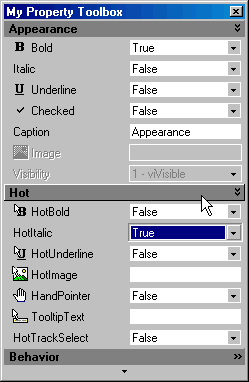
Now let's have a more detailed look at the SmartItems.
This SmartUI contains following SmartItems:
3 GroupToolBox ("Appearance", "Hot", "Behavior"), which all have their Visible property set to Visible Only In ExtendMode (Visibility=viOnlyInExtendMode)
9 ComboFlat SmartItems ("Bold", "Italic", "Underline", "Checked", "HotBold", "HotItalic", "HotUnderline", "HandPointer", "HotTrackSelect"). One of them ("Visibility") has its Enabled property set to false (Enabled=False). Most of them have Caption and Image
4 EditFlat SmartItems ("Caption", "HotImage", "TooltipText"). Most of them have Caption and Image. One of them ("Image") has its Enabled property set to false (Enabled=False).
"Hot" and "Appearance" have their Expanded property set to true (Expanded=True), whereas "Behavior" has its Expanded property set to False (Expanded=False).
All Items, except the GroupToolBox SmartItems (headers) have their Indent set to 1 (Indent=1).
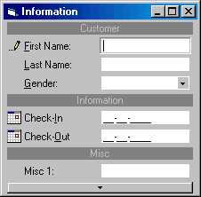
Second Example
In the second example, we needed a specific input and thus have integrated an external object.
This external Object (example VB MaskEdit control) is automatically moved or hidden, as needed, and is automatically integrated in the SmartUI, behaving exactly like a SmartItem. This means that he gets the Focus, when needed.