Version 5.0
Release Date: April 28th, 2025
Build Number: 5.0.25228.5738
Included in this release:
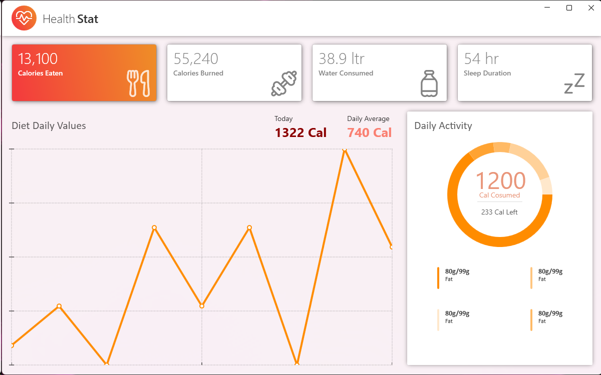
- This new version introduces Doughnut charts to the Toolkit.
- There are now more possibilities to stylize Charts in the Toolkit: angles can be smoothed out to give Charts a more modern look, gradients can now be used inside of Charts & some Charts can even be animated.
- A new feature now allows the user to have visual feedback on the mouse cursor position & the values associated with said cursor’s current position.
- In total, 8 new features and bug fixes were added to this release.
Version 4.7
Release Date: February 3rd, 2025
Build Number: 4.7.25103.5738
Included in this release:
- Xceed Toolkit for WPF is now compatible with .NET9.
- It is now possible to add Watermarks to the MaskedTextBox and CheckComboBox controls.
- It is now possible to set the color of the caret brush used by the DateTimePicker, DateTimeUpDown, NumericUpDown, TimeSpanUpDown & TimePicker controls.
- Aesthetic changes were made to the ExtendedTabControl buttons to improve their visibility.
- 4 bug fixes were added to improve the AvalonDock control.
- A total of 21 bug fixes and improvements were added with this release.
Version 4.6
Release Date: Released Mar. 4, 2024
Build Number: Build 4.6.24151.1544
Included in this release:
- The assemblies which were named xxx.NET5 are now named xxx.NET and work with all NET5+ versions of the .NET technology.
- A total of 7 bug fixes were added to this release.
Version 4.6
Release Date: Released Oct. 25, 2023
Build Number: Build 4.6.23520.14450
Included in this release:
- A new FluentDesign theme is now available in the Toolkit. It can be used on all of the controls, either in dark or light mode, with an accent color.
- To accompany the release of the FluentDesign theme, new examples & screenshots were added to the LiveExplorer.
- A new property, called IsAllItemsSelectedContentActive, was added to CheckComboBox & can be used to display the value of the AllItemsSelectedContent property or a concatenation of the selected items.
- The NETCore version of the component is no longer supported, but the NET Framework and NET5+ versions continue to be supported & updated.
- Altogether, a total of 11 improvements and bug fixes were added to this release.
Version 4.5
Release Date: Released Apr. 3, 2023
Build Number: Build 4.5.23158.14510
Included in this release:
- ExtendedTabControl now offers two new events : AddTabEvent, for when a new TabItem is added in the control, and RemoveTabEvent, which is raised when a TabItem is removed from the control.
- ExtendedTabControl now supports adding items of a custom type using the ItemsSource.
- Altogether, 16 bug fixes and improvements were added to this version.
Version 4.5
Release Date: Released Oct. 5, 2022
Build Number: Build 4.5.22477.12540
Included in this release:
- The ExtendedTabControl now offers Add, Remove and Rename options as well as a drag’n’drop feature for TabItems.
- The PropertyGrid has been reviewed and is now more reactive when using many SelectedItems.
- Added 14 new improvements to the popular docking windows control (AvalonDock).
- Altogether, 26 bug fixes and improvements were added to this version.
Version 4.4
Release Date: Released May. 14, 2022
Build Number: Build 4.4.22258.90000
Included in this release:
- A new Today button can now bring you back to today’s date in the DateTimePicker.
- Added more UI customization possibilities for WatermarkComboBox, WindowControls and the TimerPicker controls.
- Made 8 improvements to the popular AvalonDock controls.
- Added a total of 25 bug fixes and improvements.
Version 4.3.1
Release Date: Released Feb. 4, 2022
Build Number: Build 4.3.22108.21080
Included in this release:
- Added a total of 5 bug fixes and improvements
Version 4.3
Release Date: Released Dec. 21, 2021
Build Number: Build 4.3.21617.11540
Included in this release:
- Now available for Windows 11.
- Brand new LiveExplorer, which allows Toolkit controls exploration.
- Integration of the MaterialDesign theme.
- Improved memory management in AvalonDock.
- Added a total of 42 bug fixes and improvements.
Version 4.2
Release Date: Released Jul. 19, 2021
Build Number: Build 4.2.21354.9000
Included in this release:
- Now available for .NET 5.
- Added more styling options for controls with Spinner or DrowDown buttons.
- Added 10 new improvements to the docking windows control (AvalonDock) and PropertyGrid.
- Added a total of 23 improvements and bug fixes.
Version 4.1
Release Date: Released Jan. 25, 2021
Build Number: Build 4.1.20211.01251
Included in this release:
- This release includes 15 specific improvements for 2 popular controls: the PropertyGrid and AvalonDock.
- The Docking windows control(Avalon Dock) adds supports for moving floating windows behind the main Window of an application.
- A total of 27 improvements and bug fixes are included in this release.
Version 4.0.1
Release Date: Released Aug. 17, 2020
Build Number: Build 4.0.20417.14530
Included in this release:
- This release adds support for High contrast mode for all the Toolkit Controls.
- The docking windows control (AvalonDock) continues to get our attention with 14 specific improvements.
- A total of 31 improvements and bug fixes are included in this release.
Version 4.0
Release Date: Released Jan. 30, 2020
Build Number: Build 4.0.20076.12200
Included in this release:
- This release adds support for .NET Core 3.0 and up.
- Major upgrade to the docking windows control (AvalonDock) with 33 specific improvements. Increased performance for the CheckComboBox with large items source.
- A total of 63 improvements and bug fixes are included in this release.
Version 3.8
Release Date: Released Jan. 30, 2019
Build Number: Build 3.8.19076.18510
Included in this release:
- A lot of attention was put improving AvalonDock, including 15+ improvements
- More than 45 improvements and bug fixes are included in this release.
Version 3.7
Release Date: Released Jun. 18, 2018
Build Number: Build 3.7.18312.21450
Included in this release:
- Keyboard movements and selections improved for CheckComboBox, selections + incrementations + keyboard movements improved for TimeSpanUpDown, better reloading management for AvalonDock and PropertyGrid.
- A total of 27 improvements and bug fixes are included in this release.

