Feature Image

DataGrid for WPF

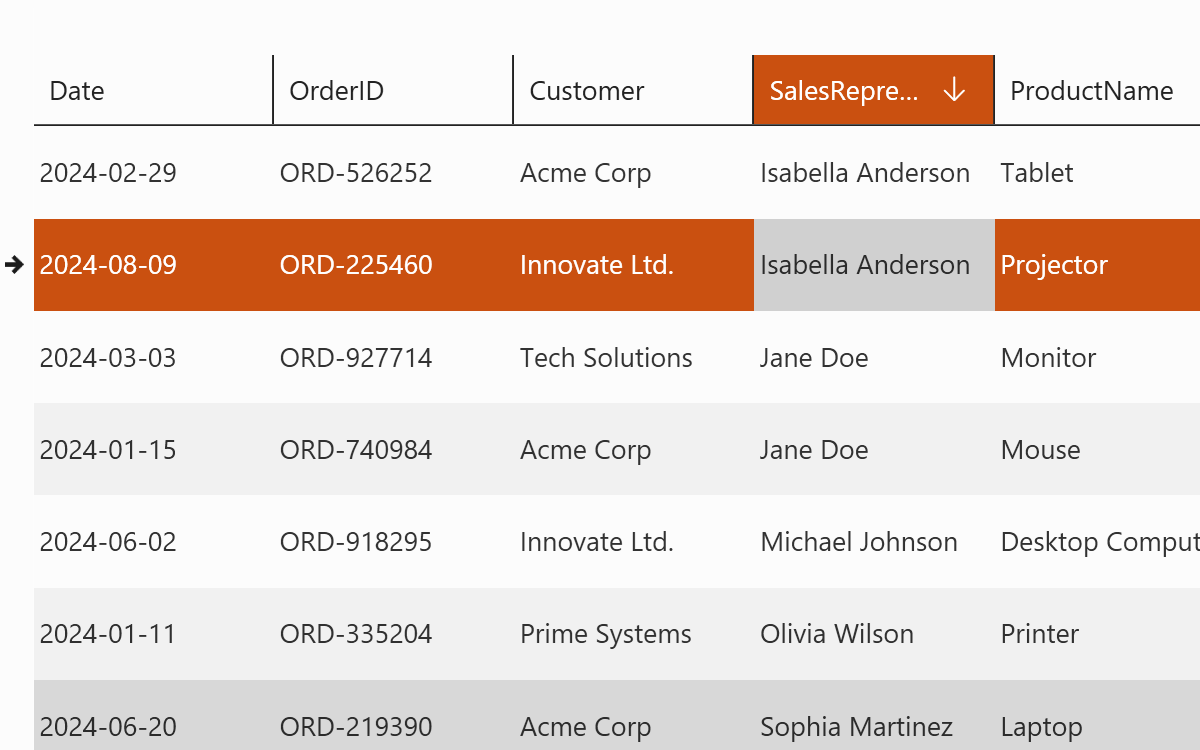
Fast, powerful, and mature, with a 13-year track record, this is the only WPF datagrid that provides a rich, fluid, and high-performance user experience. It is frequently updated and backed by a responsive support and development team whose sole ambition is your complete satisfaction. Used and trusted by Microsoft in Visual Studio, it boasts the richest feature set with over 185 capabilities.
Gallery Image
1
Subscription
Looking to renew
I’m eligible for small business pricing. Learn More
2
Quantity
3
Total
Loading...
1-Year Priority
Support
Unlimited Installs
On Any Device
Satisfaction
Guarantee
Try For Free For 45 Days!
Download

Evolutionary…

Constantly evolving—no other datagrid is updated as often—it has more features than any other offering and a flexible, extensible object model. It also provides unbeatable performance by handling millions of rows and thousands of columns, and integrates easily into any WPF app. It’s easy to understand why it’s the most-adopted WPF datagrid available and used by Microsoft in Visual Studio.

…and Revolutionary

Raw performance is supplemented by advanced data loading and caching techniques including asynchronous stealth paging, zero lag data virtualization, and preemptive data loading. Perceived performance is greatly enhanced thanks to a fully animated and fluid experience. Inertial smooth scrolling with rows that fade-in as data is received works in parallel with the data virtualization, and pre-loaded sticky group and master-detail headers help the user stay in context even when scrolling quickly.

Traditional non-animated table view is available as well, and still looks great thanks to the well-crafted themes that are included. 2D card view, and jaw-dropping animated 3D card view with stunning appearance are also provided.

Editing, Printing, Exporting

Xceed DataGrid for WPF features rich in-place editing with a full complement of flexible, themed, and themable editor controls for all kinds of data types. Provides all the mouse and keyboard interactivity necessary for efficient data entry. Rich printing allows for easy report creation, and exporting lets Excel lovers access the data in that tool if needed. Flexible filtering and powerful sorting capabilities let users find and visualize data quickly, and persist/restore features let them keep their setups.

Grouping, Master-Detail

Supports multi-level grouping with all the related features, as well as master-detail hierarchy with a single-scrollbar approach for the cleanest user experience.

Themes

Xceed DataGrid for WPF can integrate with many existing applications’ look and feel, thanks to the variety of included themes. Windows 10, Metro, Office, and custom themes are included. All are meticulously crafted.

Professional Grade

MVVM support, script-based testing support through UI automation, detailed documentation, available full source code, a responsive support team to answer your questions, and a development team that works full time on just this one control ensures your mission-critical application will be made to the highest standards and on time.

The only datagrid with asynchronous data virtualization and modern smooth scrolling mechanics: your grid feels fast even with remote data sources!

  • Created entirely for WPF, written in C# and XAML.
  • Supports .NET 4.0. and up, as well as .NET Core 3.0 .NET 6, 7, 8 .NET 2.0/3.5 is also supported in a separate and parallel build.
  • Works with Visual Studio 2022/2019/2017/2015/2013/2012/2010/2008
  • Full UI virtualization, even when grouping data, so only elements currently in view are created and kept, meaning faster loading time, uses less memory.
  • Container recycling also performed for improved scrolling speed.
  • CLS compliant, uses no unsafe blocks. XBAP-compatible version available.
  • Based on a flexible and extensible object model, with modular and reusable visual elements.
  • Can be used in conjunction with the MVVM and MVC programming patterns. MVVM support greatly improved as of v6.2.
  • Supports UI Automation covering many scenarios and enabling the use of script-based testing and assistive technologies.
  • The datagrid’s cells are true WPF content controls, so they can contain anything.
  • Supports the WPF command infrastructure, for example letting you map a toolbar button to “enter edit” in a cell.
  • Documentation integrated into Visual Studio.
  • Supports Right-To-Left and Inking.
  • Supports regional settings including numbers, money type, dates, etc.
  • Includes all the VB.NET and C# sample applications from the Live Explorer to get you started with every feature.
  • All error handling works through .NET exception classes.
  • Design-time configuration window lets you set up the most important features quickly and easily.
  • Features rich in-place editing that works in all views. See Included editor controls below.
  • Auto-detection of ComboBox columns (enums, foreign keys).
  • Updates source when the cell or row exits edit mode or immediately when the cell content changes.
  • Combo boxes can easily be used as cell editors without the need to write code to fill the combo box thanks to auto- detection of ComboBox columns (enums, foreign keys).
  • Provides Excel-like default keyboard and mouse edit behavior, including F2, Esc (cancel edit on a cell and restore the original value), Double-Esc (cancel edit on the entire row and restore the original values), and Enter.
  • Routed edit events for both cell and row, providing fine-grained control over the edit process.
  • Provides configurable keyboard and mouse edit commands.
  • Programmatic control over edit mode.
  • Allows you to specify a different visual template for a cell being edited.
  • Cell editors can be displayed without entering edit mode, under a variety of conditions such as a mouse hover over the cell or row, the cell or row becoming current, the row being edited, or always.
  • Single-click edit mode allows entering edit mode and activating items such as check, text, and combo boxes with one click.
  • Automatically selects the appropriate editor control depending on the field data type.
  • Insertion row / card object allows for quick entry of new data.
  • A continuous insertion mode lets end-users add data without having to manually move to the first editable column after finishing the previous row.
  • Triggers meaningful edit events for both rows and cells.
  • Manages “null” and “DbNull” values.
  • Any portion of the grid can be made read-only.
  • The cells in a column can be non-focusable when read-only, so they can’t be selected with either the mouse or the keyboard.
  • Lets users see their data in a master-detail hierarchy.
  • The single-scrollbar approach used in detail grids provides a more professional, integrated master/detail experience than the awkward scrollbar-within-scrollbar approach used by competing datagrids.
  • Each datarow in the main grid or in a detail can have an unlimited number of details attached to it.
  • Details can have “sibling” or “child” details, or both.
  • Details support headers and footers, grouping, sorting, and autofiltering.
  • Different style for the data items contained in each same- level detail.
  • Custom grouping in grid and details supported.
  • Custom detail relations supported.
  • Supports hierarchical, multi-level grouping in all views.
  • Customizable group-level configurations with header and footer support.
  • Supports custom grouping criteria, to allow your code to group together rows with your own conditions.
  • Interactive, hierarchical “Group-by” row allows end-users to easily create and manipulate groups themselves. Adapted for all included views.
  • Programmatic control over expanding and collapsing groups.
  • Grouping can be controlled via code.
  • Provides merged column header capabilities in TableView and TableFlowView, for improved presentation of data. Columns can be grouped under these merged headers, which span the columns they contain. Groups of columns and their associated header can be grouped under headers at higher levels too. Merged headers and their columns can be reordered and moved to same-level headers (drag-and-drop, programmatically) and removed / added back. Column headers can be resized and support the column chooser.
  • Presents data and lets users edit it in a variety of 2D and 3D views and themes. Can switch between 2D and 3D views in real-time while preserving state.
  • Traditional 2D table view with standard scrolling and no animation, as typically seen in datagrids.
  • Technically advanced Tableflow™ 2D view provides zero-lag data virtualization, inertial smooth scrolling, sticky headers, and animated user actions such as full-column reordering. Feels modern and fast.
  • Stunning, interactive Cardflow™ 3D view, with multiple card layouts.
  • TableGridflow view displays details in a tree-like structure under the main column at the master level.
  • Traditional 2D card view.
  • Ships with several backgrounds, as well as textures for 2D and 3D cards.
  • Project template for Visual Studio that sets up a new theme project so you can create your own. A tutorial on creating a custom theme is also included to help you get started.
  • Metro / ModernUI theme with Light and Dark versions and accent color.
  • Glass, Windows Media Player 11, and Zune (Glass theme currently not available for Tableflow™ view).
  • All Microsoft Windows themes: Classic (NT), Luna (Normal/Olive, Metallic/Silver, Homestead/Blue), Aero (Vista), and Royale (Media Center).
  • A vibrant Window 7 theme.
  • A Windows 10 theme.
  • A Windows 8 theme for TableFlow view.
  • Office 2007: Blue, Black, and Silver.
  • The Xceed Live Explorer theme.
  • 3D view, multi-surface: Office themes (Blue, Black, and Silver); Chameleon.
  • 18 themes in all.
  • Each theme provides an alternating row style that can be activated through the TableView class.
  • Various cursors—such as “busy”, “resize”, and “drag” cursors—can be customized in the different views.
  • Includes the commented XAML source code to the card and table view styles and templates; so you have a great starting point for developing your own.
  • Fast animated smooth scrolling (with inertia) for impressive UI performance.
  • Works together with data virtualization for great perceived responsiveness.
  • Sticky group headers (group headers are always visible, and bump previous ones away in a smooth fashion).
  • Sticky master-detail master row and headers.
  • Full-column animated drag and drop reordering.
  • Innovative group navigation control greatly increases the datagrid’s usability. It lets end-users instantly jump to any group or sub-group with a single click in a combo box. Works with multiple group levels.
  • Also has all the features of the classic (see below).
  • Smooth animation and stunning look with reflections.
  • Multiple card layouts and transitions.
  • Cards animate from one layout to another.
  • Control the offsets, spacing, and angles of cards.
  • Control camera position and angle.
  • Control field of view.
  • Four themes: Office 2007 themes (Blue, Black, and Silver); Chameleon.
  • Defaults to cards stacked into columns, with horizontal scrolling.
  • Two types of card view styles are included: compact card view (borderless cards with column separator lines) and standard card view (cards with borders, but no separator lines).
  • Supports grouping with multiple levels. Group-by row includes built-in list of columns, so end-users can still group by columns and reorder fields even if there are no column headers. Group headers flow within the card list.
  • Cards can be independently sized, each card sizing itself to its content.
  • Resizable cards in CardView.
  • Allows you to hide empty fields on a per-card basis.
  • Insertion card lets users quickly add new data to the grid.
  • Column auto-sizing / stretching and starrable column widths.
  • Custom sorting.
  • Fixed columns (UI widget + programmatic control).
  • Context menu column chooser: lets end-users add or remove columns.
  • Additional, dialog-based column chooser control for datagrids with high column counts.
  • Create custom column choosers.
  • Column headers support drag-and-drop column reordering, column resizing, click-to-sort, and dragging to “Group-by” row.
  • Row margin selects and resizes rows, and displays icons indicating that the row is current, is being edited, is an insertion, or has a validation error.
  • Provides horizontal and vertical Grid line brush and grid line thickness properties.
  • Automatically changes a row’s height to fit the contents of the largest cell.
  • Supports IDataErrorInfo.
  • Supports IEditableObject and error style when IEditableObject’s EndEdit throws an exception when trying to leave edit mode.
  • Includes built-in data validation, at the cell or row level.
  • Error display is integrated with the included views.
  • Completely style the way a cell or row looks when a validation error occurs.
  • Validate on any criteria, including the values of other cells.
  • Validation error messages are overridable and localizable.
  • Expandable and compatible with custom validation rules you have already built.
  • All included editor controls are usable either as cell viewers / editors, or independently outside of the grid for a more flexible and uniform interface.
  • CheckBox.
  • AutoSelectTextBox.
  • DatePicker/Calendar.
  • ValueRangeTextBox.
  • NumericTextBox.
  • MaskedTextBox.
  • DateTimeTextBox.
  • Sample code: IPAddressMaskedTextBox.
  • Sample code: PhoneMaskedTextBox (North American format).
  • Sample code: Simple CurrencyMaskedTextBox.
  • Sample code: ExponentNumericTextBox.
  • Sample code: DateTimeTextBox (with ShortDate, ShortTime, ShortDateAndShortTime, and ShortDateAndLongTime formats).
  • All controls are 100% stylable and templatable.
  • Combinability/modularity: Embed controls into one another to create flexible, innovative new controls.
  • The grid automatically picks the correct type depending on the data type of the column.
  • Fully visual approach: Powerful designers help make development faster and easier.
  • Extensibility: All controls can be extended to implement custom features, appearance, and behavior.
  • Data virtualization (sometimes called “virtual mode” or “lazy loading”) vastly improves performance and reduces memory usage, especially when working with large data sources, loading data only when it’s needed. Also supports grouping and data sources implementing IQueryable (LINQ). (See it in action!)
  • Because it’s asynchronous, the data virtualization implementation decouples the UI from the data source, which keeps the application responsive while data is being retrieved. It also supports caching, pre-emptive data loading, and delayed triggering of events to avoid needless querying during scrolling.
  • New asynchronous binding mode.
  • Filtering (auto filtering and filter row) in virtualized collection view, letting you combine the advantage of a data virtualization performance boost and the flexibility of filtering.
  • Filter row supports columns with custom types.
  • Special row type for grid and group headers and footers that lets you bind to, and display, additional data sources.
  • Indicator glyphs let end-users know when virtualized data is being loaded and committed, and when there has been an error.
  • Support for Entity Framework data sources, making the developer’s job easier when he or she must work with different types of data sources, as there is less code to write.
  • Ability to customize the content of the AutoFilterControl, which allows any ListBox- or Selector-based control to handle how a specific column’s values are automatically filtered.
  • Provides column virtualization, which allows you to work with a large number of columns while keeping performance reasonable.
  • Inserting records into non-IBindingList sources.
  • Easy binding to XML data sources.
  • Excel-like end-user automatic filtering, which provides a drop-down box in the column header, allowing end-users to filter by one or more items, on a per-column basis. New events for auto- filter changes allow for improved control.
  • Custom CollectionView that provides fine-grained and efficient control over its underlying data source.
  • Fully supports WPF data binding.
  • Displays, edits, and works with bound and unbound data.
  • Directly supports unbound columns, allowing for example the display of static information such as a delete button for each row, etc.
  • Supports unbound data fields, which facilitates the use of calculated columns.
  • Custom key-value mappings, which lets you map any kind of value or object to fields in the data that represent keys, such as mapping an employee first and last name fields to an integer ID field in an employee database.
  • Can be bound directly to an array of simple types such as String, Decimal, DateTime, TimeSpan, Guid, or Primitive (e.g., SByte, Byte, Int32, etc.), and will show the value of those types in one column.
  • Automatically obtains and synchronizes bound data from any .NET source, including jagged arrays, any object that implements IListSource or IList, and any ADO.NET DataSet, DataTable, DataView, or DataViewManager object.
  • Can intercept, parse, and modify data being synchronized with the database from the grid.
  • Headers and footers editor control for users (new in v7.0).
  • Powerful statistical editor control for users (new in v6.7).
  • Powerful search capability with intuitive UI for users (new in v6.4).
  • Automatic and manual cell merging/spanning allowing users to easily spot similar or related information (new in v6.4).
  • Excel-like drag-to-select multiple rows or cells without holding the shift key.
  • Selected rows can now be drag-and-dropped to another application, e.g. Excel.
  • Ability to sort foreign key columns by the values displayed in its cells rather than by the foreign key value itself.
  • Group selection allows selecting or unselecting all rows within a group by clicking the group header.
  • Supports White, Ranorex, and certain editions of HP’s QuickTest Professional (QTP), allowing for automated UI testing.
  • Excel export of grid contents, including groups, detail content, and statistical functions (formulas and values), using XMLSS or CSV.
  • Excel-like cell and row selection capabilities (single, multiple, and extended modes), letting end-users select and copy blocks of cells or rows.
  • Clipboard copy support allows content from the grid to be copied to any other supported application (e.g., Excel, Word, Notepad). Can be sent to the clipboard as HTML or CSV.
  • Unicode support in CSV clipboard copy.
  • Persist user settings: saves the positions and states of columns, as well as grouping and sorting states, etc. Can be extended by developers to persist other aspects.
  • Delete selected rows command: in master grid, in details, or both.
  • Ability to enable or disable sorting, grouping, and column reordering via the UI.
  • Full keyboard navigation is possible through cells and rows. Navigation can be limited to cell-only or row- only, or navigation can be disabled.
  • Allows multiple-field sort and custom criteria sort.
  • Shows sort priority of each multi-sorted column.
  • Provides easy manipulation of the grid’s current row.
  • Scrolls the view to any cell, row, group, or column.
  • Scroll tip displays information about the first visible row in the viewport when the grid is scrolled.
  • Allows elements other than columns to be fixed.
  • Provides fixed, non-scrolling header and footer regions into which you can put any number and type of row or card.
  • 14 statistical functions that can be used both inside and outside of a grid in any element. Sorting is now supported on the results of these functions.
  • Row scrolling is configurable to be immediate (items are scrolled immediately as the thumb is dragged) or deferred (items are not scrolled until the scroll thumb is released).
  • Customizable “today” label in the Calendar.
  • Ability to create alternating styles for data rows.
  • Built-in printing and print exporting capability with fully customizable progress dialog and page layouts.
  • Print preview capabilities let the end-user see what a document will look like before printing it—page view and layout configurations are reflected in the preview. And everything happens in the background, so there is no waiting for the entire preview to be generated.
  • Customizable group-header control display.

Try For Free For 45 Days!

Download