The following page provides a list of examples that demonstrate how to customize multi-surface themes. For more multi-surface theme-related information, refer to the Multi-surface Themes topic.
Providing surface configurations
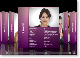
The following example demonstrates how to provide an image and title surface configuration that will be applied to the center surface and a title surface configuration that will be applied to the left and right side cards.
| XAML |
Copy Code |
|---|---|
<Grid xmlns:xcdg="http://schemas.xceed.com/wpf/xaml/datagrid"> <Grid.Resources> <xcdg:DataGridCollectionViewSource x:Key="cvs_employees" Source="{Binding Source={x:Static Application.Current}, Path=EmployeesTable}"/> </Grid.Resources> <xcdg:DataGridControl x:Name="EmployeesGrid" ItemsSource="{Binding Source={StaticResource cvs_employees}}"> <xcdg:DataGridControl.Columns> <xcdg:Column FieldName="LastName" IsMainColumn="True"/> </xcdg:DataGridControl.Columns> <xcdg:DataGridControl.View> <xcdg:CardflowView3D> <xcdg:CardflowView3D.Theme> <xcdg:ElementalBlackTheme> <xcdg:ElementalBlackTheme.SurfaceConfigurations> <!-- Because an attempt is made to automatically detect an image in the data item, there is no need to specify the name of the field that contains the image in the surface configuration's ImageRegionConfiguration. If a data item contains more than one image you can set the FieldNames property of the ImageRegionConfiguration to the name of the field that contains the desired image. --> <xcdg:ImageAndTitleSurfaceConfiguration xcdg:CardflowView3D.Surfaces="Center"/> <!-- By default, the value of the main column will be displayed in the title regions. --> <xcdg:TitleSurfaceConfiguration xcdg:CardflowView3D.Surfaces="Left, Right"/> </xcdg:ElementalBlackTheme.SurfaceConfigurations> </xcdg:ElementalBlackTheme> </xcdg:CardflowView3D.Theme> </xcdg:CardflowView3D> </xcdg:DataGridControl.View> </xcdg:DataGridControl> </Grid> | |
| VB.NET |
Copy Code |
|---|---|
dataGridControl.Columns( "LastName" ).IsMainColumn = True Dim view As New CardflowView3D() Dim theme As New ElementalBlackTheme() ' Because an attempt is made to automatically detect an image in the data ' item, there is no need to specify the name of the field that contains ' the image in the surface configuration's ImageRegionConfiguration. ' If a data item contains more than one image you can set the FieldNames ' property of the ImageRegionConfiguration to the name of the field that ' contains the desired image. Dim imageAndTitleSurfaceConfiguration As new ImageAndTitleSurfaceConfiguration() imageAndTitleSurfaceConfiguration.SetValue( CardflowView3D.SurfacesProperty, CardflowView3DSurfaces.Center ) ' By default, the value of the main column will be displayed in the title regions. Dim titleSurfaceConfiguration As New TitleSurfaceConfiguration() titleSurfaceConfiguration.SetValue( CardflowView3D.SurfacesProperty, CardflowView3DSurfaces.Left And CardflowView3DSurfaces.Right ) theme.SurfaceConfigurations.Add( imageAndTitleSurfaceConfiguration ) theme.SurfaceConfigurations.Add( titleSurfaceConfiguration ) view.Theme = theme dataGridControl.View = view | |
| C# |
Copy Code |
|---|---|
dataGridControl.Columns[ "LastName" ].IsMainColumn = true; CardflowView3D view = new CardflowView3D(); ElementalBlackTheme theme = new ElementalBlackTheme(); // Because an attempt is made to automatically detect an image in the data // item, there is no need to specify the name of the field that contains // the image in the surface configuration's ImageRegionConfiguration. // If a data item contains more than one image you can set the FieldNames // property of the ImageRegionConfiguration to the name of the field that // contains the desired image. ImageAndTitleSurfaceConfiguration imageAndTitleSurfaceConfiguration = new ImageAndTitleSurfaceConfiguration(); imageAndTitleSurfaceConfiguration.SetValue( CardflowView3D.SurfacesProperty, CardflowView3DSurfaces.Center ); // By default, the value of the main column will be displayed in the title regions. TitleSurfaceConfiguration titleSurfaceConfiguration = new TitleSurfaceConfiguration(); titleSurfaceConfiguration.SetValue( CardflowView3D.SurfacesProperty, CardflowView3DSurfaces.Left | CardflowView3DSurfaces.Right ); theme.SurfaceConfigurations.Add( imageAndTitleSurfaceConfiguration ); theme.SurfaceConfigurations.Add( titleSurfaceConfiguration ); view.Theme = theme; dataGridControl.View = view; | |
Providing a default region configuration
The following example demonstrates how to provide a default title-region configuration that will be used by all surfaces that display a title.
| XAML |
Copy Code |
|---|---|
<Grid xmlns:xcdg="http://schemas.xceed.com/wpf/xaml/datagrid"> <Grid.Resources> <xcdg:DataGridCollectionViewSource x:Key="cvs_employees" Source="{Binding Source={x:Static Application.Current}, Path=EmployeesTable}"/> </Grid.Resources> <xcdg:DataGridControl x:Name="EmployeesGrid" ItemsSource="{Binding Source={StaticResource cvs_employees}}"> <xcdg:DataGridControl.View> <xcdg:CardflowView3D> <xcdg:CardflowView3D.Theme> <xcdg:ElementalBlackTheme> <!-- The DefaultTitleRegionConfiguration will be applied to all title regions in all surfaces for which a RegionConfiguration has not been explicitly provided. --> <xcdg:ElementalBlackTheme.DefaultTitleRegionConfiguration> <xcdg:RegionConfiguration FieldNames="TitleOfCourtesy, FirstName, LastName, Title" ReadOnly="True"> <xcdg:RegionConfiguration.Template> <DataTemplate> <Viewbox> <StackPanel> <StackPanel Orientation="Horizontal" HorizontalAlignment="Center"> <StackPanel.Resources> <Style TargetType="{x:Type xcdg:DataCell}"> <Setter Property="Margin" Value="0, 0, 3, 0"/> </Style> </StackPanel.Resources> <xcdg:DataCell FieldName="TitleOfCourtesy"/> <xcdg:DataCell FieldName="FirstName"/> <xcdg:DataCell FieldName="LastName"/> </StackPanel> <xcdg:DataCell FieldName="Title" TextElement.FontSize="10" HorizontalContentAlignment="Center"/> </StackPanel> </Viewbox> </DataTemplate> </xcdg:RegionConfiguration.Template> </xcdg:RegionConfiguration> </xcdg:ElementalBlackTheme.DefaultTitleRegionConfiguration> </xcdg:ElementalBlackTheme> </xcdg:CardflowView3D.Theme> </xcdg:CardflowView3D> </xcdg:DataGridControl.View> </xcdg:DataGridControl> </Grid> | |
Defining region configurations
The following example demonstrates how to define default and explicit region configurations.
| XAML |
Copy Code |
|---|---|
<Grid xmlns:xcdg="http://schemas.xceed.com/wpf/xaml/datagrid"> <Grid.Resources> <xcdg:DataGridCollectionViewSource x:Key="cvs_employees" Source="{Binding Source={x:Static Application.Current}, Path=EmployeesTable}" AutoCreateItemProperties="False"> <xcdg:DataGridCollectionViewSource.ItemProperties> <!--Will be explicitly positioned in the default "Title" region.--> <xcdg:DataGridItemProperty Name="Title"/> <xcdg:DataGridItemProperty Name="FirstName"/> <xcdg:DataGridItemProperty Name="LastName"/> <xcdg:DataGridItemProperty Name="TitleOfCourtesy"/> <!--Will be automatically detected as containing an image and displayed in the "Image" region.--> <xcdg:DataGridItemProperty Name="Photo"/> <!--Will appear in the "Data" region. There is no need to explicitly position them as, by default, the "Data" region displays information from the fields that have not been explicitly assigned to another region.--> <xcdg:DataGridItemProperty Name="EmployeeID" Title="Employee Identification #"/> <xcdg:DataGridItemProperty Name="Address"/> <xcdg:DataGridItemProperty Name="City"/> <xcdg:DataGridItemProperty Name="Country"/> <xcdg:DataGridItemProperty Name="PostalCode" Title="Postal Code"/> <xcdg:DataGridItemProperty Name="HomePhone" Title="Home Phone Number"/> <xcdg:DataGridItemProperty Name="BirthDate" Title="Date of Birth"/> </xcdg:DataGridCollectionViewSource.ItemProperties> </xcdg:DataGridCollectionViewSource> </Grid.Resources> <xcdg:DataGridControl x:Name="EmployeesGrid" ItemsSource="{Binding Source={StaticResource cvs_employees}}"> <xcdg:DataGridControl.View> <xcdg:CardflowView3D> <xcdg:CardflowView3D.Theme> <xcdg:ElementalBlackTheme> <!-- The DefaultTitleRegionConfiguration will be applied to all title regions in all surfaces for which a RegionConfiguration has not been explicitly provided. --> <xcdg:ElementalBlackTheme.DefaultTitleRegionConfiguration> <xcdg:RegionConfiguration FieldNames="TitleOfCourtesy, FirstName, LastName, Title" ReadOnly="True"> <xcdg:RegionConfiguration.Template> <DataTemplate> <Viewbox> <StackPanel> <StackPanel Orientation="Horizontal" HorizontalAlignment="Center"> <StackPanel.Resources> <Style TargetType="{x:Type xcdg:DataCell}"> <Setter Property="Margin" Value="0, 0, 3, 0"/> </Style> </StackPanel.Resources> <xcdg:DataCell FieldName="TitleOfCourtesy"/> <xcdg:DataCell FieldName="FirstName"/> <xcdg:DataCell FieldName="LastName"/> </StackPanel> <xcdg:DataCell FieldName="Title" TextElement.FontSize="10" HorizontalContentAlignment="Center"/> </StackPanel> </Viewbox> </DataTemplate> </xcdg:RegionConfiguration.Template> </xcdg:RegionConfiguration> </xcdg:ElementalBlackTheme.DefaultTitleRegionConfiguration> <xcdg:ElementalBlackTheme.SurfaceConfigurations> <!-- Because an attempt is made to automatically detect an image in the data item, there is no need to specify the name of the field that contains the image in the surface configuration's ImageRegionConfiguration. If a data item contains more than one image you can set the FieldNames property of the ImageRegionConfiguration to the name of the field that contains the desired image. --> <xcdg:ImageAndTitleSurfaceConfiguration xcdg:CardflowView3D.Surfaces="Center"/> <!-- Explicitly define a new template for the TitleRegionConfiguration since we want to use one that is different from the one provided in the DefaultTitleRegionConfiguration. In this situation, the names of the fields to display in the title region must be provided. --> <xcdg:TitleSurfaceConfiguration xcdg:CardflowView3D.Surfaces="Left, Right"> <xcdg:TitleSurfaceConfiguration.TitleRegionConfiguration> <xcdg:RegionConfiguration FieldNames="FirstName, LastName" ReadOnly="True"> <xcdg:RegionConfiguration.Template> <DataTemplate> <!--In this example, a fixed font size is not ideal since we don't know the final size of a card and we want the font size of the Title to vary along with the card size; therefore, we will place everything in a Viewbox, which will handle everything.--> <Viewbox> <!-- Using a Viewbox will stretch each title according to its content resulting in titles that can be of various sizes. This result may not always be esthetically pleasing and can also produce perspective problems (optical illusions). Giving the root element of the Viewbox an arbitrary width will correct this undesirable behavior. This size of 100 was determined by trial and error using our data source and it may be appropriate to change it according to the data.--> <Grid Width="100"> <!--This grid is used to center the title when its desired width is less than 100.--> <Grid.ColumnDefinitions> <ColumnDefinition Width="*"/> <ColumnDefinition Width="Auto"/> <ColumnDefinition Width="*"/> </Grid.ColumnDefinitions> <StackPanel Orientation="Horizontal" Grid.Column="1"> <xcdg:DataCell FieldName="FirstName" Margin="0, 0, 3, 0"/> <xcdg:DataCell FieldName="LastName"/> </StackPanel> </Grid> </Viewbox> </DataTemplate> </xcdg:RegionConfiguration.Template> </xcdg:RegionConfiguration> </xcdg:TitleSurfaceConfiguration.TitleRegionConfiguration> </xcdg:TitleSurfaceConfiguration> <!-- In this surface configuration there is no need to specify the field names to use since: - the image field is automatically detected and used in the image region - the fields used in the title region are specified in the DefaultTitleRegionConfiguration - the fields that have not been explicitly assigned to a specific region will automatically be placed in the default "Data" region. --> <xcdg:CompleteSurfaceConfiguration xcdg:CardflowView3D.Surfaces="Back"/> </xcdg:ElementalBlackTheme.SurfaceConfigurations> </xcdg:ElementalBlackTheme> </xcdg:CardflowView3D.Theme> </xcdg:CardflowView3D> </xcdg:DataGridControl.View> </xcdg:DataGridControl> </Grid> | |
Setting a multi-surface theme
The following example demonstrates how to set a multi-surface theme using property element syntax.
| XAML |
Copy Code |
|---|---|
<Grid xmlns:xcdg="http://schemas.xceed.com/wpf/xaml/datagrid"> <Grid.Resources> <xcdg:DataGridCollectionViewSource x:Key="cvs_employees" Source="{Binding Source={x:Static Application.Current}, Path=EmployeesTable}"/> </Grid.Resources> <xcdg:DataGridControl x:Name="EmployeesGrid" ItemsSource="{Binding Source={StaticResource cvs_employees}}"> <xcdg:DataGridControl.View> <xcdg:CardflowView3D> <xcdg:CardflowView3D.Theme> <xcdg:ChameleonTheme/> </xcdg:CardflowView3D.Theme> </xcdg:CardflowView3D> </xcdg:DataGridControl.View> </xcdg:DataGridControl> </Grid> | |
| VB.NET |
Copy Code |
|---|---|
Dim view As New CardflowView3D() view.Theme = New ChameleonTheme() dataGridControl.View = view | |
| C# |
Copy Code |
|---|---|
CardflowView3D view = new CardflowView3D(); view.Theme = new ChameleonTheme(); dataGridControl.View = view; | |
Changing a title-region position
The following example demonstrates how to change the position of the title-surface configuration's title region.
| XAML |
Copy Code |
|---|---|
<Grid xmlns:xcdg="http://schemas.xceed.com/wpf/xaml/datagrid"> <Grid.Resources> <xcdg:DataGridCollectionViewSource x:Key="cvs_employees" Source="{Binding Source={x:Static Application.Current}, Path=EmployeesTable}"/> </Grid.Resources> <xcdg:DataGridControl x:Name="EmployeesGrid" ItemsSource="{Binding Source={StaticResource cvs_employees}}"> <xcdg:DataGridControl.View> <xcdg:CardflowView3D> <xcdg:CardflowView3D.Theme> <xcdg:ElementalBlackTheme> <!-- The DefaultTitleRegionConfiguration will be applied to all title regions in all surfaces for which a RegionConfiguration has not been explicitly provided. --> <xcdg:ElementalBlackTheme.DefaultTitleRegionConfiguration> <xcdg:RegionConfiguration FieldNames="FirstName, LastName" ShowCellTitles="False" ReadOnly="True"> <xcdg:RegionConfiguration.Template> <DataTemplate> <!-- In this example, a fixed font size is not ideal since we don't know the final size of a card and we want the font size of the Title to vary along with the card size; therefore, we will place everything in a Viewbox, which will handle everything. --> <Viewbox> <!-- Using a Viewbox will stretch each title according to its content resulting in titles that can be of various sizes. This result may not always be esthetically pleasing and can also produce perspective problems (optical illusions). Giving the root element of the Viewbox an arbitrary width will correct this undesirable behavior. This size of 125 was determined by trial and error using our data source and it may be appropriate to change it according to the data. --> <Grid Width="125"> <!-- This grid is used to center the title when its desired width is less than 100. --> <Grid.ColumnDefinitions> <ColumnDefinition Width="*"/> <ColumnDefinition Width="Auto"/> <ColumnDefinition Width="*"/> </Grid.ColumnDefinitions> <StackPanel Orientation="Horizontal" Grid.Column="1"> <xcdg:DataCell FieldName="FirstName" Margin="0, 0, 3, 0"/> <xcdg:DataCell FieldName="LastName"/> </StackPanel> </Grid> </Viewbox> </DataTemplate> </xcdg:RegionConfiguration.Template> </xcdg:RegionConfiguration> </xcdg:ElementalBlackTheme.DefaultTitleRegionConfiguration> <xcdg:ElementalBlackTheme.SurfaceConfigurations> <!-- Because an attempt is made to automatically detect an image in the data item, there is no need to specify the name of the field that contains the image in the surface configuration's ImageRegionConfiguration. --> <xcdg:ImageAndTitleSurfaceConfiguration xcdg:CardflowView3D.Surfaces="Center"/> <!-- This surface will use the DefaultTitleRegionConfiguration; however, it will display its title region in the middle oft he surface rather than the bottom (default). It is important to note that themes decide what title-region positions they support and for which surface configuration. --> <xcdg:TitleSurfaceConfiguration xcdg:CardflowView3D.Surfaces="Left, Right" xcdg:ElementalBlackTheme.TitleRegionPosition="Middle"/> <!--In this surface configuration there is no need to specify the field names to use since: - the image field is automatically detected and used in the image region - the fields used in the title region are specified in the DefaultTitleRegionConfiguration - the fields that have not been explicitly assigned to a specific region will automatically be placed in the default "Data" region.--> <xcdg:CompleteSurfaceConfiguration xcdg:CardflowView3D.Surfaces="Back"/> </xcdg:ElementalBlackTheme.SurfaceConfigurations> </xcdg:ElementalBlackTheme> </xcdg:CardflowView3D.Theme> </xcdg:CardflowView3D> </xcdg:DataGridControl.View> </xcdg:DataGridControl> </Grid> | |
Providing new gradient colors
The following example demonstrates how to change the gradient applied to the card surfaces when using the Chameleon theme.
| XAML |
Copy Code |
|---|---|
<Grid xmlns:xcdg="http://schemas.xceed.com/wpf/xaml/datagrid"> <Grid.Resources> <xcdg:DataGridCollectionViewSource x:Key="cvs_employees" Source="{Binding Source={x:Static Application.Current}, Path=EmployeesTable}"/> </Grid.Resources> <xcdg:DataGridControl x:Name="EmployeesGrid" ItemsSource="{Binding Source={StaticResource cvs_employees}}"> <xcdg:DataGridControl.Columns> <xcdg:Column FieldName="LastName" IsMainColumn="True"/> <xcdg:Column FieldName="Notes" Visible="False"/> <xcdg:Column FieldName="ReportsTo" Visible="False"/> <xcdg:Column FieldName="StillEmployed" Visible="False"/> <xcdg:Column FieldName="TitleOfCourtesy" Visible="False"/> </xcdg:DataGridControl.Columns> <xcdg:DataGridControl.View> <xcdg:CardflowView3D> <xcdg:CardflowView3D.Theme> <xcdg:ChameleonTheme GradientLightColor="Pink" GradientDarkColor="Purple"> </xcdg:ChameleonTheme> </xcdg:CardflowView3D.Theme> </xcdg:CardflowView3D> </xcdg:DataGridControl.View> </xcdg:DataGridControl> </Grid> | |
| VB.NET |
Copy Code |
|---|---|
dataGridControl.Columns( "LastName" ).IsMainColumn = True dataGridControl.Columns( "Notes" ).Visible= False dataGridControl.Columns( "ReportsTo" ).Visible = False dataGridControl.Columns( "StillEmployed" ).Visible = False dataGridControl.Columns( "TitleOfCourtesy" ).Visible = False Dim theme As New ChameleonTheme() theme.GradientLightColor = Brushes.Pink.Color theme.GradientDarkColor = Brushes.Purple.Color Dim view As New CardflowView3D() view.Theme = theme dataGridControl.View = view | |
| C# |
Copy Code |
|---|---|
dataGridControl.Columns[ "LastName" ].IsMainColumn = true; dataGridControl.Columns[ "Notes" ].Visible= false; dataGridControl.Columns[ "ReportsTo" ].Visible = false; dataGridControl.Columns[ "StillEmployed" ].Visible = false; dataGridControl.Columns[ "TitleOfCourtesy" ].Visible = false; ChameleonTheme theme = new ChameleonTheme(); theme.GradientLightColor = Brushes.Pink.Color; theme.GradientDarkColor = Brushes.Purple.Color; CardflowView3D view = new CardflowView3D(); view.Theme = theme; dataGridControl.View = view; | |
Creating a custom surface configuration and multi-surface theme
Because creating a custom surface configuration and multi-surface theme requires more than a code snippet to demonstrate, links to the required classes are provided below:
 Show All
 Hide All