Xceed SmartUI Documentation
To launch the Property Pages, you first need to select the SmartUI, to right-click on the mouse, and select Properties in the Popup Menu. The Global Tab is automatically displayed.
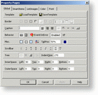
You can select any .stp file as Template for your current SmartUI object. You can also save your current SmartUI, or current project as a Template for future applications or objects.

You first can set the Border Style: None (BorderStyle=bsNone), SingleLine (BorderStyle=bsSingleLine), DoubleLine (BorderStyle=bsDoubleLine), Sunken (BorderStyle=bsSunken), Raised (BorderStyle=bsRaised), Etched (BorderStyle=bsEtched), Bump (BorderStyle=bsBump).
You also can set the Edge Style, which will be drawn: any combination of Left, Right, Top, and Bottom Border (EdgeStyle=[= EdgeConstants]).

The editable Caption can be justified on the left (CaptionAlignment=alLeftJustify), on the right, or on the center of the SmartUI.
You can set the CaptionStyle: None, Above, Frame, Flat, Header.

The Orientation can be Horizontal or Vertical. You can decide to generate a Error event within the SmartUI. And you can decide to enable the SmartUI or not (through the Enabled Property).

The BackStyle can be set to transparent, opaque, or semi-transparent. You can decide to sort the SmartItems alphabetically or not (through the Sorted Property).
You can define the position of the Tabulation (through the TabPos Property). The Tabulation is the separation of Caption and Value. In PropertyLists, this separation is the vertical line which is visible. In ListItems or PropertyToolBoxes, this separation is invisible. There are 2 ways of defining TabPos: specify a percentage, for example 30%, (the position will automatically be changed by the resize of the object); Or specify a fixed value in same unit than the parent. By default, TabPos is set to 50%.
To implement it, you will have to insert a VB Tab in the code, or to use the button add a tabulation, in the SmartItems Property Pages.
You can also decide to show a focus rect on each item having the focus. If you set the ShowFocusRect property to true, a dotted line will be displayed around the selected item.

You can choose to implement the following ScrollBarStyle: None, Normal, FlatTrack3D (the buttons are flat and get displayed in 3D style when the mouse goes hover them), FlatInvert (idem, but gets inverted), ButtonOnly (no Bar between the two buttons), Button3DOnly, Pager3D (whole width on vertical SmartUIs and whole height on horizontal SmartUIs), PagerFlat, PagerAuto (when the mouse goes hover one on the buttons, the SmartUI automatically scrolls).

You can decide to implement the following PlusMinusStyle:
And you can specify an Indent for the whole SmartUI (Indent)

You can specify the InnerSpace Bottom, InnerSpace Left, InnerSpace Right, InnerSpace Top Values.

You can specify the OuterSpace Bottom, OuterSpace Left, OuterSpace Right, OuterSpace Top Values.

In the Global Tab of the Property Pages, the apply button is disabled, when the properties automatically are applied (WYSIWYG).
SmartItems Tab, ListImages Tab, Color Tab, Font Tab