|
Prerequisite Knowledge Views and Themes: Themes Overview |
The Glass, Windows Media Player 11, Xceed Live Explorer, Windows10, Material Design and Fluent Design themes, which are represented by the GlassTheme, WMP11Theme, LiveExplorerTheme, Windows10Theme, MaterialDesignTheme and FluentDesignTheme classes, respectively, are non-tradional themes that can give any application a unique appearance.
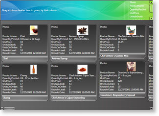 Figure 1: Card view in Glass theme |
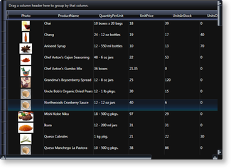 Figure 2: Table view in Windows Media Player 11 theme |
These themes are contained in "Theme Packs" that contains various non-system themes. In order to use these themes, which are located in Theme Pack 1, Theme Pack 2, Theme Pack 3, Theme Pack 4, Theme Pack 5, Theme Pack 6 and Theme Pack 7 the containing assemblies must be added to the project references (see Table 1). Like other themes, they can be set using either attribute syntax or property element syntax through a multi-surface view's Theme property (see Example 1).
Table 1: Theme syntaxes
| Theme | Color scheme | Attribute syntax | Property element syntax | Target views | Assembly |
|---|---|---|---|---|---|
| Windows Media Player 11 | [View.]WMP11 [View.]WMP11Theme |
WMP11Theme | TableflowView TableView CardView CompactCardView TreeGridflowView |
Xceed.Wpf.DataGrid.ThemePack.1 | |
| Glass | [View.]Glass [View.]GlassTheme |
GlassTheme | TableView CardView CompactCardView |
Xceed.Wpf.DataGrid.ThemePack.2 | |
| LiveExplorer | [View.]LiveExplorer [View.]LiveExplorerTheme |
LiveExplorerTheme | TableflowView TableView CardView CompactCardView TreeGridflowView |
Xceed.Wpf.DataGrid.ThemePack.3 | |
| Metro (Modern Application theme) |
[View.]MetroLight |
MetroTheme | TableflowView TableView |
Xceed.Wpf.DataGrid.ThemePack.4 | |
| Windows10 | [View.]Windows10 [View.]Windows10Theme |
Windows10Theme | TableflowView TableView TreeGridflowView |
Xceed.Wpf.DataGrid.ThemePack.5 | |
| MaterialDesign | [View.]MaterialDesignLight [View.]MaterialDesignLightTheme [View.]MaterialDesignDark [View.]MaterialDesignDarkTheme |
MaterialDesignTheme | TableflowView TableView CardView CompactCardView TreeGridflowView |
Xceed.Wpf.DataGrid.ThemePack.6 | |
| FluentDesign | [View.]FluentDesignLight [View.]FluentDesignLightTheme [View.]FluentDesignDark [View.]FluentDesignDarkTheme |
FluentDesignTheme | TableflowView TableView TreeGridflowView |
Xceed.Wpf.DataGrid.ThemePack.7 |
All examples in this topic assume that the grid is bound to the Employees table of the Northwind database, unless stated otherwise.
Example 1: Using Glass theme
The following example demonstrates how to set the Glass theme using property element syntax.
| XAML |
Copy Code |
|---|---|
<Grid xmlns:xcdg="http://schemas.xceed.com/wpf/xaml/datagrid"> <Grid.Resources> <xcdg:DataGridCollectionViewSource x:Key="cvs_employees" Source="{Binding Source={x:Static Application.Current}, Path=EmployeesTable}"/> </Grid.Resources> <xcdg:DataGridControl x:Name="EmployeesGrid" ItemsSource="{Binding Source={StaticResource cvs_employees}}"> <xcdg:DataGridControl.View> <xcdg:CardView> <xcdg:CardView.Theme> <xcdg:GlassTheme/> </xcdg:CardView.Theme> </xcdg:CardView> </xcdg:DataGridControl.View> </xcdg:DataGridControl> </Grid> | |