Xceed DataGrid for WPF v7.3 Documentation
 |
Prerequisite Knowledge Views and Themes: Multi-surface Themes Overview |
The Chameleon multi-surface theme, which is represented by the ChameleonTheme class, is a two-tone theme that provides full control over its gradient color scheme.
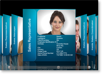
Figure 1: Chameleon theme with default surface configurations
and color scheme
The Chameleon theme is contained in the "Views 3D" assembly (Xceed.Wpf.DataGrid.Views3D.dll), and like other themes, it can be set using either attribute syntax or property element syntax through a multi-surface view's Theme property (see Example 1).
| Theme | Color scheme | Attribute syntax | Property element syntax | Target views | Assembly |
|---|---|---|---|---|---|
| Chameleon | [View.]Chameleon [View.]ChameleonTheme |
ChameleonTheme | CardflowView3D | Xceed.Wpf.DataGrid.Views3D |
Unique to the Chameleon multi-surface theme is the ability to control the colors that are used to create its gradient. Through the GradientLightColor and GradientDarkColor properties, the colors that will be blended from top to bottom, respectively, can be provided (see Example 2).
If a surface configuration is added to the SurfaceConfigurations collection but does not specify the surfaces to which it should be applied, it will be ignored. If more than one configuration specifies the same surface, the last one on which the Surfaces attached property was set will be used.
Table 1: Default Chameleon surface configurations
| Multi-surface view | Surface | Default surface configuration | Index |
|---|---|---|---|
| CardflowView3D | Left | ImageAndTitleSurfaceConfiguration | 0 |
| CardflowView3D | Right | ImageAndTitleSurfaceConfiguration | 1 |
| CardflowView3D | Center | CompleteSurfaceConfiguration | 2 |
| CardflowView3D | Back | DataSurfaceConfiguration | 3 |
For some surface configurations, the Chameleon theme supports more than one title-region position (see Table 2). As such, it exposes a TitleRegionPosition attached property that can be set on any of the supported surface configurations to change the position of the title region. The TitleRegionPosition property can also be set directly on the theme to change the title-region position of all the supported surface configurations.
Table 2: Possible title-region positions
All examples in this topic assume that the grid is bound to the Employees table of the Northwind database, unless stated otherwise.
Example 1: Using the Chameleon theme
The following example demonstrates how to set a multi-surface theme using property element syntax.
| XAML |
Copy Code |
|---|---|
<Grid xmlns:xcdg="http://schemas.xceed.com/wpf/xaml/datagrid"> <Grid.Resources> <xcdg:DataGridCollectionViewSource x:Key="cvs_employees" Source="{Binding Source={x:Static Application.Current}, Path=EmployeesTable}"/> </Grid.Resources> <xcdg:DataGridControl x:Name="EmployeesGrid" ItemsSource="{Binding Source={StaticResource cvs_employees}}"> <xcdg:DataGridControl.View> <xcdg:CardflowView3D> <xcdg:CardflowView3D.Theme> <xcdg:ChameleonTheme/> </xcdg:CardflowView3D.Theme> </xcdg:CardflowView3D> </xcdg:DataGridControl.View> </xcdg:DataGridControl> </Grid> | |
| VB.NET |
Copy Code |
|---|---|
Dim view As New CardflowView3D() view.Theme = New ChameleonTheme() dataGridControl.View = view | |
| C# |
Copy Code |
|---|---|
CardflowView3D view = new CardflowView3D(); view.Theme = new ChameleonTheme(); dataGridControl.View = view; | |
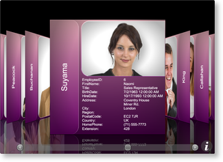
Example 2: Providing new gradient colors
The following example demonstrates how to change the gradient applied to the card surfaces when using the Chameleon theme.
| XAML |
Copy Code |
|---|---|
<Grid xmlns:xcdg="http://schemas.xceed.com/wpf/xaml/datagrid"> <Grid.Resources> <xcdg:DataGridCollectionViewSource x:Key="cvs_employees" Source="{Binding Source={x:Static Application.Current}, Path=EmployeesTable}"/> </Grid.Resources> <xcdg:DataGridControl x:Name="EmployeesGrid" ItemsSource="{Binding Source={StaticResource cvs_employees}}"> <xcdg:DataGridControl.Columns> <xcdg:Column FieldName="LastName" IsMainColumn="True"/> <xcdg:Column FieldName="Notes" Visible="False"/> <xcdg:Column FieldName="ReportsTo" Visible="False"/> <xcdg:Column FieldName="StillEmployed" Visible="False"/> <xcdg:Column FieldName="TitleOfCourtesy" Visible="False"/> </xcdg:DataGridControl.Columns> <xcdg:DataGridControl.View> <xcdg:CardflowView3D> <xcdg:CardflowView3D.Theme> <xcdg:ChameleonTheme GradientLightColor="Pink" GradientDarkColor="Purple"> </xcdg:ChameleonTheme> </xcdg:CardflowView3D.Theme> </xcdg:CardflowView3D> </xcdg:DataGridControl.View> </xcdg:DataGridControl> </Grid> | |
| VB.NET |
Copy Code |
|---|---|
dataGridControl.Columns( "LastName" ).IsMainColumn = True dataGridControl.Columns( "Notes" ).Visible= False dataGridControl.Columns( "ReportsTo" ).Visible = False dataGridControl.Columns( "StillEmployed" ).Visible = False dataGridControl.Columns( "TitleOfCourtesy" ).Visible = False Dim theme As New ChameleonTheme() theme.GradientLightColor = Brushes.Pink.Color theme.GradientDarkColor = Brushes.Purple.Color Dim view As New CardflowView3D() view.Theme = theme dataGridControl.View = view | |
| C# |
Copy Code |
|---|---|
dataGridControl.Columns[ "LastName" ].IsMainColumn = true; dataGridControl.Columns[ "Notes" ].Visible= false; dataGridControl.Columns[ "ReportsTo" ].Visible = false; dataGridControl.Columns[ "StillEmployed" ].Visible = false; dataGridControl.Columns[ "TitleOfCourtesy" ].Visible = false; ChameleonTheme theme = new ChameleonTheme(); theme.GradientLightColor = Brushes.Pink.Color; theme.GradientDarkColor = Brushes.Purple.Color; CardflowView3D view = new CardflowView3D(); view.Theme = theme; dataGridControl.View = view; | |
 Show All
 Hide All