Feature Image

Editors for Winforms

Provides essential editor/input controls for Windows Forms applications. The controls are modular and can be combined to get the exact results required for all your UI needs.

Gallery Image
Suite Icon

Available in our Suites

Explore Cost-Effective Bundles Tailored for Your Needs

Starting

$1,379.95 US

Provides essential editor/input controls for Windows Forms applications. The controls are modular and can be combined to get the exact results required for all your UI needs.

  • Extensible controls
  • Powerful design-time tools, work visually
  • Includes various themes
Part of Xceed Grid for WinForms, also part of Xceed Ultimate Suite A full set of modular editor controls for creating flexible UIs, including buttons, calendars, checkboxes, combo boxes, date pickers, horizontal and vertical scroll bars, panel, and text boxes. The controls are combinable, and other controls can be placed within them to create new ones. Provides all the features you need, including customizability, convenient designers, and various themes such as Windows Aero and Office.
  • Combinability/modularity: The ability to embed controls into one another to create flexible, innovative new controls.
  • Fully visual approach: Powerful designers help make development faster and easier.
  • Dropdown feature: Any Windows Forms control can dropdown any other control, allowing for absolute flexibility.
  • Extensibility: All controls can be extended to implement custom features, appearance, and behavior.
  • Themes: Support for Windows Aero themes, including custom themes; support for Windows classic themes and the ability to adapt to the current Windows theme.
  • Integral resizing: Forces display of the last item in its entirety.
  • Optimized compatibility with Xceed Input Validator for .NET.
  • Custom painting: Provides more meaningful user feedback.
  • Auto-complete capabilities.
  • The Editor controls are fully integrated into Xceed Grid for .NET, are used as the grid’s default editors, and can be used outside of the grid for a more uniform user interface.
  • WinCalculator and WinNumericTextBox.
  • Buttons: Built-in button types; embeddable in WinComboBox, WinDatePicker, WinCalendar and WinTextBox; theming.
  • Calculators: Theming.
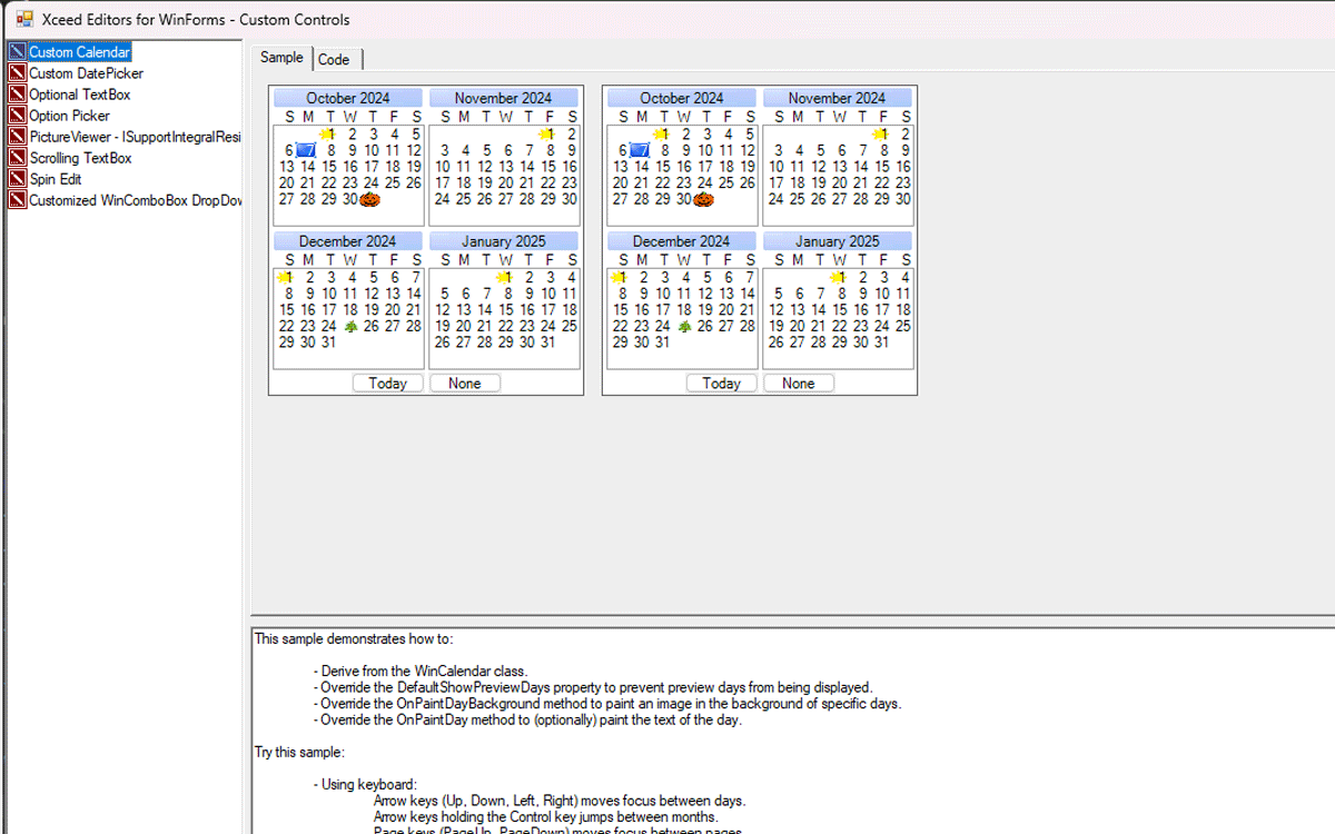
  • Calendars: Multiple or single months; integral resizing; Day mouse events; owner-drawing and custom margins; theming; key and mouse navigation; button.
  • Check boxes: Theming.
  • Combo boxes: Data binding; multiple columns; mask support; theming; image support.
  • Date pickers: Distinct edit and display formats; theming.
  • Horizontal and vertical scrollbars: Theming.
  • Numeric text boxes: Mask support; support for SideButtons; enhanced BorderStyles.
  • Panels: base container for dropdown support; theming; enhanced BorderStyles
  • Text boxes: Mask support; support for SideButtons; enhanced BorderStyles.
  • Custom calendar.
  • Optional textbox.
  • Option picker.
  • Picture viewer.
  • Scrolling textbox.
  • Spin edit.
  • Customized WinComboBox dropdown.
  • Toolbar (available in its own demo app).
  • Stretchable agenda (available in its own demo app).
  • Written entirely in managed C# code (source code is available through a Blueprint subscription).
  • Includes VB.NET and C# samples for Visual Studio.
  • Object-oriented design created exclusively for version 2.0/3.5 and all 4.X versions of the .NET Framework.
  • Comprehensive documentation fully integrated into Visual Studio.
  • All error handling works through .NET exception classes.
  • CLS compliant (Common Language Specification).
  • Does not use unsafe blocks to minimize security risks.
  • Integrates well into dashboard and business intelligence software.