 |
Prerequisite Knowledge DataGrid Fundamentals: Views and Themes Overview |
The CardView and CompactCardView classes provide card-view layouts for the data items in a grid. Either layout can be used to display data items as cards; however, the compact card-view layout applies well when a database has many columns but few of the fields contain data. In this case, the fields that do not contain data will not be displayed in the cards, giving them a more compact appearance.
The terms "card" and "insertion card" respectively refer to the DataRow and InsertionRow objects displayed in a grid's viewport when a grid is in a card-view layout.
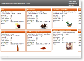
Figure 1: Card view in Zune theme
By default, the data displayed in a card's title is determined by a grid's main (primary) column. The content of the cell whose field name matches the field name of the main column will be displayed in the corresponding card's title. If left unmodified, the main column will be the first column that is added to a grid's Columns collection; however, the main column can be changed by setting a column's IsMainColumn property to true (see Example 3).
Views define their associated grid's fixed header and fixed footer sections, which are non-scrollable regions usually located at the top and bottom of a grid, and its header and footer sections, which are scrollable regions usually located, respectively, beneath the fixed header and above the fixed footer sections (see Example 1).
By default, a grid will have a HierarhicalGroupByControl and ColumnManagerRow in its fixed header section. In XAML, the content of a header, footer, fixed header, and footer sections can be cleared by setting the UseDefaultHeadersFooters property of a view to false (see Example 2). If left to true, any items that are added to a header or footer section will be added after the default headers and footers.
All examples in this topic assume that the grid is bound to the Orders table of the Northwind database, unless stated otherwise.
Example 1: Adding an InsertionRow to the fixed headers
The following example demonstrates how to add an InsertionRow to the fixed header section of a grid.
| XAML |
Copy Code |
|---|---|
<Grid xmlns:xcdg="http://schemas.xceed.com/wpf/xaml/datagrid"> <Grid.Resources> <xcdg:DataGridCollectionViewSource x:Key="cvs_orders" Source="{Binding Source={x:Static Application.Current}, Path=Orders}"/> </Grid.Resources> <xcdg:DataGridControl x:Name="OrdersGrid" ItemsSource="{Binding Source={StaticResource cvs_orders}}"> <xcdg:DataGridControl.View> <xcdg:TableView> <xcdg:TableView.FixedHeaders> <DataTemplate> <xcdg:InsertionRow/> </DataTemplate> </xcdg:TableView.FixedHeaders> </xcdg:TableView> </xcdg:DataGridControl.View> </xcdg:DataGridControl> </Grid> | |
Example 2: Clearing a fixed header section
The following example demonstrates how to clear the content of all header and footer sections of a grid using its view's UseDefaultHeadersFooters property.
| XAML |
Copy Code |
|---|---|
<Grid xmlns:xcdg="http://schemas.xceed.com/wpf/xaml/datagrid"> <Grid.Resources> <xcdg:DataGridCollectionViewSource x:Key="cvs_orders" Source="{Binding Source={x:Static Application.Current}, Path=Orders}"/> </Grid.Resources> <xcdg:DataGridControl x:Name="OrdersGrid" ItemsSource="{Binding Source={StaticResource cvs_orders}}"> <xcdg:DataGridControl.View> <xcdg:CardView UseDefaultHeadersFooters="False"/> </xcdg:DataGridControl.View> </xcdg:DataGridControl> </Grid> | |
| VB.NET |
Copy Code |
|---|---|
Dim view As New CardView() view.UseDefaultHeadersFooters = False dataGridControl.View = view | |
| C# |
Copy Code |
|---|---|
CardView view = new CardView(); view.UseDefaultHeadersFooters = false; dataGridControl.View = view; | |
Example 3: Changing the main (primary) column
The following example demonstrates how to set the ShipName column as a grid's main column.
| XAML |
Copy Code |
|---|---|
<Grid xmlns:xcdg="http://schemas.xceed.com/wpf/xaml/datagrid"> <Grid.Resources> <xcdg:DataGridCollectionViewSource x:Key="cvs_orders" Source="{Binding Source={x:Static Application.Current}, Path=Orders}"/> </Grid.Resources> <xcdg:DataGridControl x:Name="OrdersGrid" ItemsSource="{Binding Source={StaticResource cvs_orders}}" View="CardView"> <xcdg:DataGridControl.Columns> <xcdg:Column FieldName="ShipName" IsMainColumn="True"/> </xcdg:DataGridControl.Columns> </xcdg:DataGridControl> </Grid> | |
| VB.NET |
Copy Code |
|---|---|
dataGridControl.Columns( "ShipName" ).IsMainColumn = True | |
| C# |
Copy Code |
|---|---|
dataGridControl.Columns[ "ShipName" ].IsMainColumn = true; | |
Example 4: Adding separator lines
The following examples demonstrates how to add separator lines between card "columns".
| XAML |
Copy Code |
|---|---|
<Grid xmlns:xcdg="http://schemas.xceed.com/wpf/xaml/datagrid"> <Grid.Resources> <xcdg:DataGridCollectionViewSource x:Key="cvs_orders" Source="{Binding Source={x:Static Application.Current}, Path=Orders}"/> </Grid.Resources> <xcdg:DataGridControl x:Name="OrdersGrid" ItemsSource="{Binding Source={StaticResource cvs_orders}}"> <xcdg:DataGridControl.View> <xcdg:CardView> <xcdg:CardView.SeparatorLinePen> <Pen Thickness="1.5" Brush="Orange" DashStyle="{x:Static DashStyles.DashDotDot}"/> </xcdg:CardView.SeparatorLinePen> </xcdg:CardView> </xcdg:DataGridControl.View> </xcdg:DataGridControl> </Grid> | |
| VB.NET |
Copy Code |
|---|---|
Dim pen As New Pen() pen.Thickness = 1.5 pen.Brush = Brushes.Orange pen.DashStyle = DashStyles.DashDotDot Dim view As New CardView() view.SeparatorLinePen = pen dataGridControl.View = view | |
| C# |
Copy Code |
|---|---|
Pen pen = new Pen(); pen.Thickness = 1.5; pen.Brush = Brushes.Orange; pen.DashStyle = DashStyles.DashDotDot; CardView view = new CardView(); view.SeparatorLinePen = pen; dataGridControl.View = view; | |
Example 5: Recreating the default card-view header
The following example demonstrates how to recreate the default card-view header, which contains a ColumnManagerRow to the right of a GroupByControl.
| XAML |
Copy Code |
|---|---|
<Grid xmlns:xcdg="http://schemas.xceed.com/wpf/xaml/datagrid"> <Grid.Resources> <xcdg:DataGridCollectionViewSource x:Key="cvs_orders" Source="{Binding Source={x:Static Application.Current}, Path=Orders}"/> </Grid.Resources> <xcdg:DataGridControl x:Name="OrdersGrid" ItemsSource="{Binding Source={StaticResource cvs_orders}}"> <xcdg:DataGridControl.View> <xcdg:CardView UseDefaultHeadersFooters="False"> <xcdg:CardView.FixedHeaders> <DataTemplate> <DockPanel> <!-- OneWay binding is used because we want the ColumnManagerRow's height to follow what is defined by the GroupByControl. A FallbackValue is specified so the initial measure pass has an acceptable minimal value.--> <xcdg:ColumnManagerRow DockPanel.Dock="Right" Height="{Binding ElementName=groupByControl, Path=ActualHeight, Mode=OneWay, FallbackValue=60}"/> <xcdg:GroupByControl x:Name="groupByControl"/> </DockPanel> </DataTemplate> </xcdg:CardView.FixedHeaders> </xcdg:CardView> </xcdg:DataGridControl.View> </xcdg:DataGridControl> </Grid> | |
 Show All
 Hide All