Learn more about Xceed DataGrid for WPF
Today let’s look at the Searching options and Cell Error Styles that the datagrid offers.
SearchControl
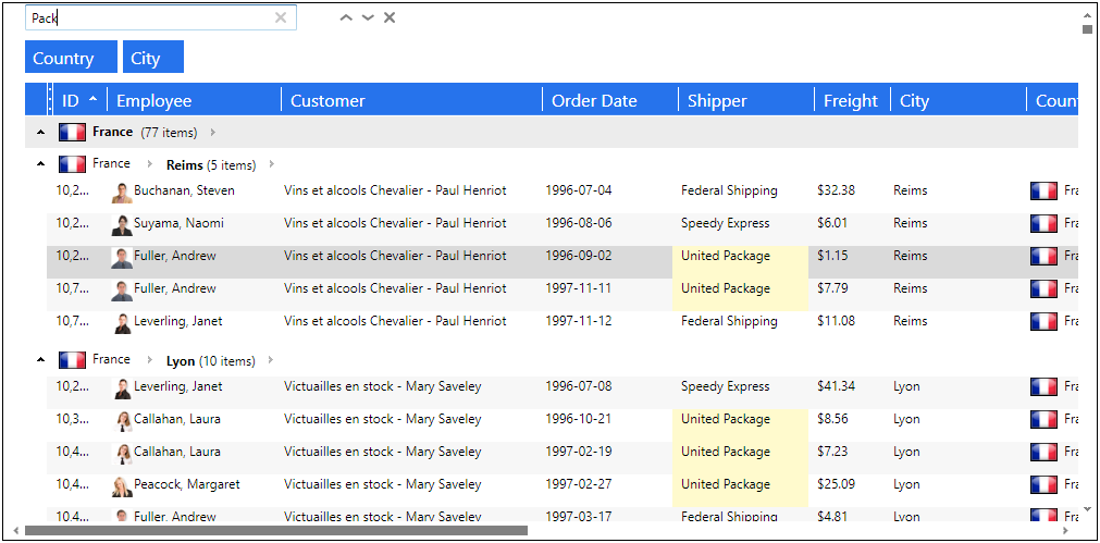
The DataGrid for WPF offers a built-in search option through the use of the SearchControl.
The SearchControl makes it possible to search text throughout the entire data source, to search for occurrences of a specific text value within the DataGrid. It searches every visible column, whatever its data type is, to find the text in any part of cell’s content (corresponding to a “contains” search). Every visible cell containing the text is highlighted to see at a glance which cells contain the searched text.

By default, the SearchControl is not visible, to activated it the end user must press CTRL-F. It will then automatically appear above the GroupByControl. It can be closed by the end user by clicking on the Close button, or by pressing the Escape key anywhere in the datagrid. However, if there is text in the SearchControl, pressing Escape will clear the text rather the closing the control, and provided that no cell or row is being edited, in which case the Escape will simply terminate the editing process.
It is possible to use the DataGridCommands (the OpenSearch, CloseSearch and ToggleSearch commands), and set them on a control, like a Button or a CheckBox, to allow the end user to activate it with the help of the mouse rather than the keyboard. It can also be added to the FixedHeaders or FixedFooters of the DataGridControl.
<Grid xmlns:xcdg="http://schemas.xceed.com/wpf/xaml/datagrid">
	<Grid.Resources>
		<xcdg:DataGridCollectionViewSource x:Key="cvs_orders"
						   Source="{Binding Source={x:Static Application.Current}, Path=Orders}">
	</Grid.Resources>
	<Grid.RowDefinitions>
		<RowDefinition Height="Auto" />
		<RowDefinition />
	</Grid.RowDefinitions>
	<Button Content="Toggle search control"
		Command="xcdg:DataGridCommands.ToggleSearch"
		CommandTarget="{Binding ElementName=OrdersGrid}" />
	<xcdg:DataGridControl x:Name="OrdersGrid"
			      Grid.Row="1"
			      ItemsSource="{Binding Source={StaticResource cvs_orders}}">
	</xcdg:DataGridControl>
</Grid>
The SearchControl also includes Next and Previous buttons, which allows to find the next or previous matched value, starting from the current cell. Pressing F3 (Next) and Shift-F3 (Previous) are also supported. If the SearchControl is closed while a value is present in it, it is still possible to find the next or previous matched value by using the F3 or Shift-F3 keys. Setting the SearchText property on DataGridControl in code behind will have the same effect.
Notes:
The SearchControl is not supported in Card Views.When manually adding the SearchControl to the FixedHeaders or FixedFooters of the DataGridControl, the end user cannot remove it, the Close button is not visible, and the Escape key is not active. It can only be removed in code behind.
Styling the SearchControl
The look of the SearchControl can be customized through a Style, for example we can change the Watermark text.
<Grid xmlns:xcdg="http://schemas.xceed.com/wpf/xaml/datagrid">
	<Grid.Resources>
		<xcdg:DataGridCollectionViewSource x:Key="cvs_orders"
						   Source="{Binding Source={x:Static Application.Current}, Path=Orders}">
			<Style TargetType="{x:Type xcdg:SearchControl}">
				<Setter Property="Watermark" Value="Type some text here" />
			</Style>
		</xcdg:DataGridCollectionViewSource>
	</Grid.Resources>

	<xcdg:DataGridControl x:Name="OrdersGrid"
			      ItemsSource="{Binding Source={StaticResource cvs_orders}}">
	</xcdg:DataGridControl>
</Grid>
Disabling the SearchControl
It is possible to prevent the SearchControl from being activated by the end user. This is done by setting the AllowSearch property on the DataGridControl to false. This essentially disables the CTRL-F key combination
<Grid xmlns:xcdg="http://schemas.xceed.com/wpf/xaml/datagrid">
	<Grid.Resources>
		<xcdg:DataGridCollectionViewSource x:Key="cvs_orders"
						   Source="{Binding Source={x:Static Application.Current}, Path=Orders}" />
	</Grid.Resources>

	<xcdg:DataGridControl x:Name="OrdersGrid"
			      AllowSearch=false
			      ItemsSource="{Binding Source={StaticResource cvs_orders}}">
	</xcdg:DataGridControl>
</Grid>
Cell Error Styles
By default, when the value of a cell fails the validation process, it will take on a different style to provide a visual cue that an error occurred.

This appearance can be redefined to be customized, to do so the CellErrorStyle property can be set to a new style, which will be used when a validation error occurs. The error style can be provided at the grid, row, column, or cell levels by setting their respective CellErrorStyle properties.
When defining a style to use when a cell is in error, a key must be provided otherwise the style will be applied to all objects of the style’s specified target type.
<Grid xmlns:xcdg="http://schemas.xceed.com/wpf/xaml/datagrid"
      xmlns:local="clr-namespace:Xceed.Wpf.Documentation">
	<Grid.Resources>
		<xcdg:DataGridCollectionViewSource x:Key="cvs_composers"
						   Source="{Binding Source={x:Static Application.Current},Path=Composers}"/>
		<Style x:Key="cell_error" TargetType="{x:Type xcdg:DataCell}">
			<Setter Property="Foreground" Value="Red"/>
		</Style>
	</Grid.Resources>

	<xcdg:DataGridControl ItemsSource="{Binding Source={StaticResource cvs_composers}}"
			      CellErrorStyle="{StaticResource cell_error}">
		<xcdg:DataGridControl.Columns>
			<xcdg:Column FieldName="Period"
				     CellEditor="{StaticResource periodEditor}">
				<xcdg:Column.CellValidationRules>
					<local:PeriodVSCompositionCountCellValidationRule/>
				</xcdg:Column.CellValidationRules>
			</xcdg:Column>
			<xcdg:Column FieldName="CompositionCount">
				<xcdg:Column.CellValidationRules>
					<local:PeriodVSCompositionCountCellValidationRule />
				</xcdg:Column.CellValidationRules>
			</xcdg:Column>
		</xcdg:DataGridControl.Columns>
	</xcdg:DataGridControl>
</Grid>
Note:
The IsValidationErrorRestrictive property, found on the Row class, indicates whether the validation error that failed prevents the focus from moving to another row until the error is fixed. Usually, all errors are restrictive; however validation errors reported through IDataErrorInfo are considered non-restrictive. By default, when a non-restrictive error occurs an orange-toned error style will be used.
For more information, please refer to the documentation.
