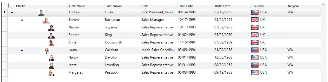
Available views in Xceed DataGrid for WPF
Learn more about Xceed DataGrid for WPF
Now that we've seen how to get started with the DataGrid for WPF, before going more in-depth, let's take a step back this time and take a quick look at the different views that are available.
What is a View?
A view is essentially the layout that the DataGrid will use to display the data. The DataGrid currently supports the following built-in views:
TableView
TableflowView
TreeGridflowView
CardView / CompactCardView
CardflowView3D
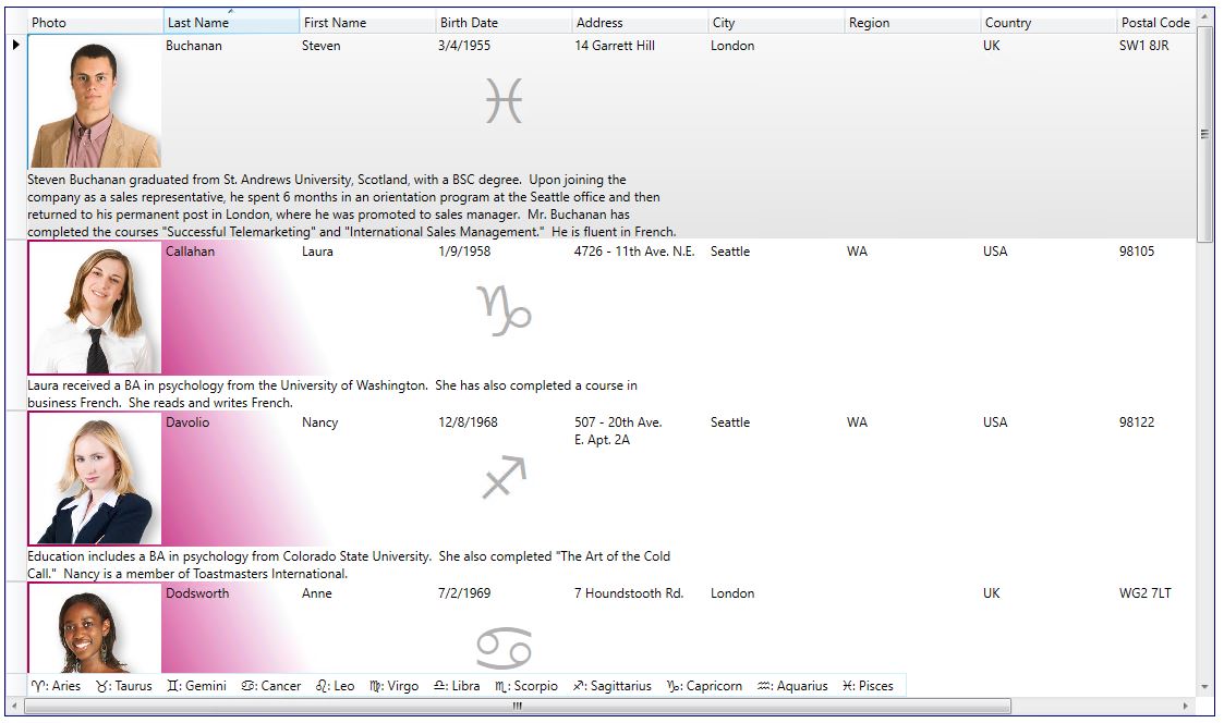
TableView
The TableView class provides a traditional, non-animated table-view layout for the data items in a grid.
<xcdg:DataGridControl x:Name="OrdersGrid"
		ItemsSource="{Binding Source={StaticResource cvs_orders}}">
	<xcdg:DataGridControl.View>
		<xcdg:TableView>
			[...]
		</xcdg:TableView>
	</xcdg:DataGridControl.View>
</xcdg:DataGridControl>
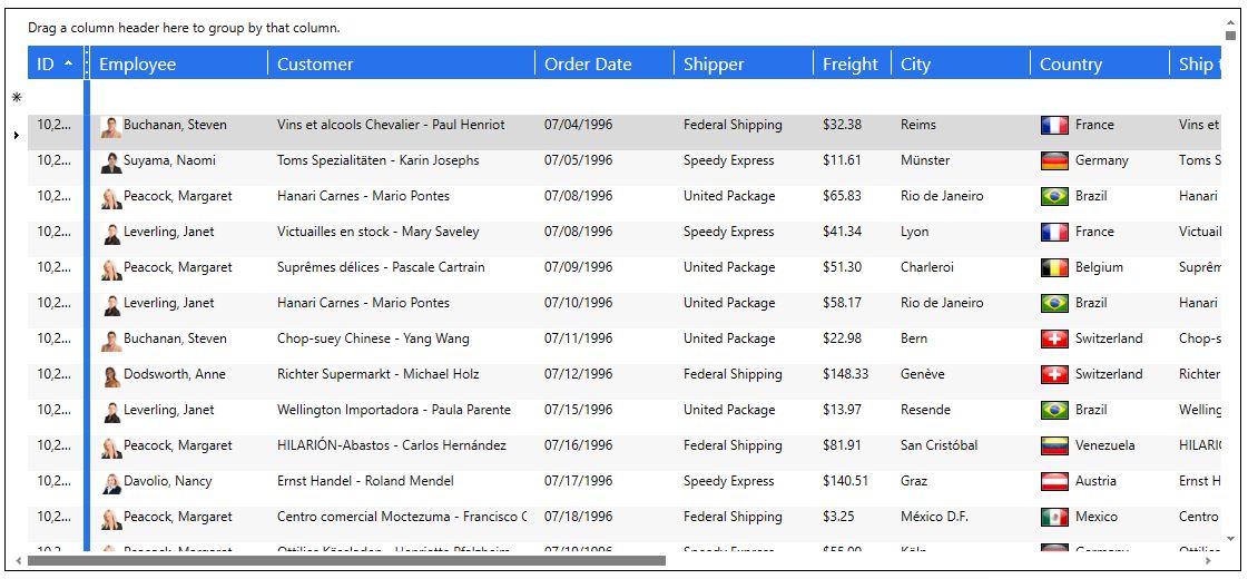
More information available in the Table Views Overview and TableView Class documentation
TableflowView
The TableflowView is similar to the TableView in the sense that it is also a table-view layout. However, it provides a rich, fluid, and high performance user experience, featuring a capabilities such as inertial smooth scrolling and animated full-column reordering, which mimic the physics of real-life movement.
<xcdg:DataGridControl x:Name="OrdersGrid"
		ItemsSource="{Binding Source={StaticResource cvs_orders}}">
	<xcdg:DataGridControl.View>
		<xcdg:TableflowView>
			[...]
		</xcdg:TableflowView>
	</xcdg:DataGridControl.View>
</xcdg:DataGridControl>
More information available in the Table Views Overview and TableflowView Class documentation
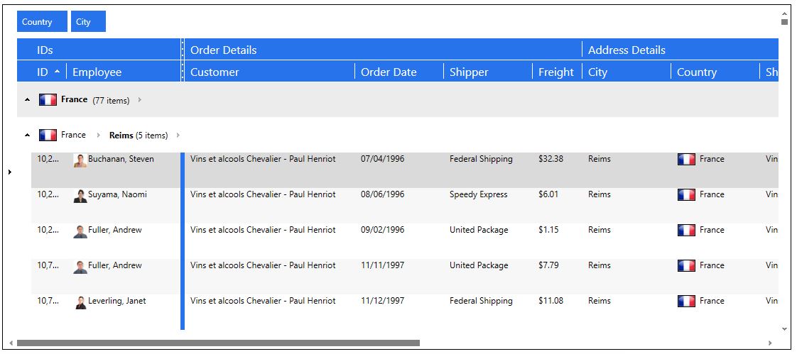
TreeGridflowView
The TreeGridflowView represents a table-view layout similar to TableflowView, in which rows are laid out horizontally as in traditional grid-like styles, but detail columns are aligned with the columns of the master, and one column displays data using a tree-structure.
Like TableflowView, it provides animated smooth scrolling, sticky group headers and sticky master-detail master row and headers, full-column animated drag and drop reordering.
<xcdg:DataGridControl x:Name="OrdersGrid"
		ItemsSource="{Binding Source={StaticResource cvs_orders}}">
	<xcdg:DataGridControl.View>
		<xcdg:TreeGridflowView>
			[...]
		</xcdg:TreeGridflowView>
	</xcdg:DataGridControl.View>
</xcdg:DataGridControl>
More information available in the Table Views Overview and TableflowView Class documentation
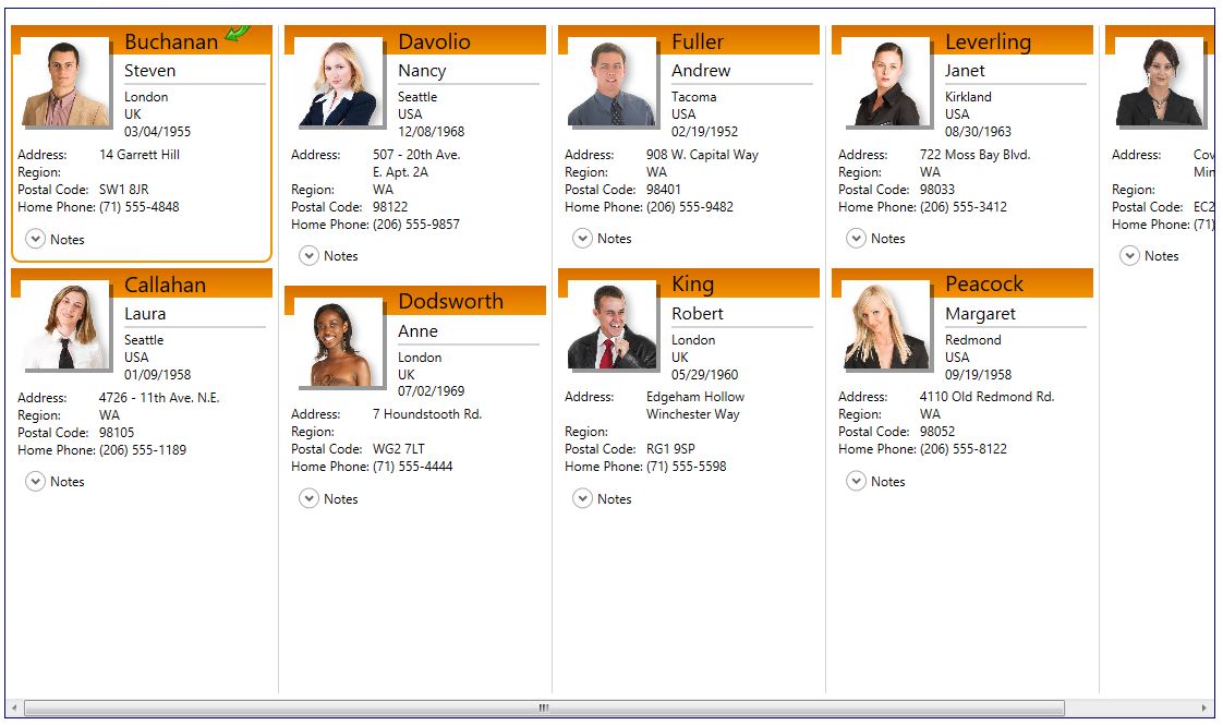
CardView
The CardView and CompactCardView provide card-view layouts for the data items in a grid. Either layout can be used to display data items as cards. However, the compact card-view layout applies well when a database has many columns but few of the fields contain data. In this case, the fields that do not contain data will not be displayed in the cards, giving them a more compact appearance.
<xcdg:DataGridControl x:Name="OrdersGrid"
		ItemsSource="{Binding Source={StaticResource cvs_orders}}">
	<xcdg:DataGridControl.View>
		<xcdg:CardView>
			[...]
		</xcdg:CardView>
	</xcdg:DataGridControl.View>
</xcdg:DataGridControl>
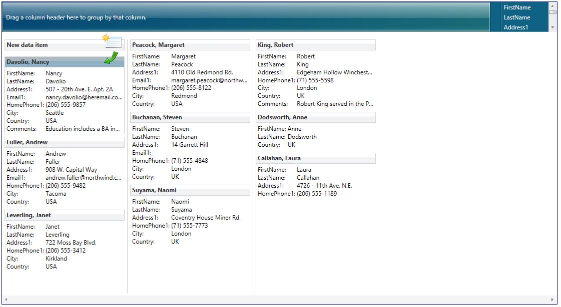
More information available in the Card Views documentation
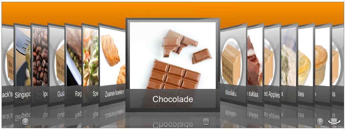
CardflowView3D
The CardflowView3D provides a 3-dimentsional card-view layout for the data items in a grid, and allows various card "surfaces" to display data using customized, theme-defined surface configurations.
<xcdg:DataGridControl x:Name="OrdersGrid"
		ItemsSource="{Binding Source={StaticResource cvs_orders}}">
	<xcdg:DataGridControl.View>
		<xcdg:CardflowView3D>
			[...]
		</xcdg:CardflowView3D>
	</xcdg:DataGridControl.View>
</xcdg:DataGridControl>
More information available in the Cardflow 3D View documentation
Custom view
If you prefer, you can also change control templates and/or data templates, change the way rows or cards are laid out, the way fields are laid out within rows or cards, add animation, or change general behavior. The sky is the limit with how this 100% lookless control can appear!
Example of a custom table view
Example of a custom card view
Choosing the right view
As you can see, each view has it's own style. The best advice we can give is to simply try them all for yourself to see which you prefer for a given scenario in your project.
For more information, please refer to the documentation.