Xceed DataGrid for WPF v7.2 Documentation
Cardflow 3D View
 |
Prerequisite Knowledge Views: Multi-surface Views Overview |
The Cardflow™ 3D view, which is represented by the CardflowView3D class, provides a 3-dimensional card-view layout for the data items in a grid and allows various card "surfaces" to display data using customized, theme-defined surface configurations.
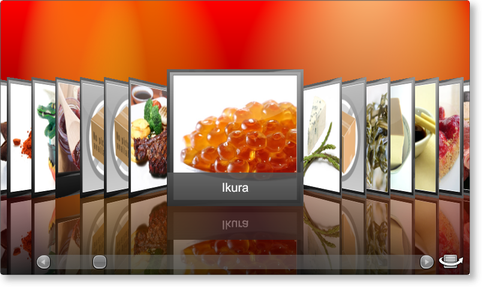
Figure 1: Cardflow 3D view in Elemental Black theme with Aurora Red background
The Cardflow 3D view exposes different surfaces that can be configured to display data. These include the Left and Right surfaces, which are displayed on all cards located to the left and right of the center card, respectively, the Center surface, which is displayed on the front of the center card, and the Back surface, which is displayed on the back of the center card (see Figure 1 in Multi-surface Views Overview).
The following table provides a list of the surfaces configurations that are supported by the various multi-surface themes that support the Cardflow 3D view:
Table 1: Provided surface configurations
| Surface configuration | Theme | Description |
|---|---|---|
| CompleteSurfaceConfiguration | Elemental Themes Chameleon Theme |
Represents a surface configuration that consists of an image, title, and data region. |
| ImageSurfaceConfiguration | Elemental Themes Chameleon Theme |
Represents a surface configuration that consists of only an image region. |
| TitleSurfaceConfiguration | Elemental Themes Chameleon Theme |
Represents a surface configuration that consists of only a title region. |
| DataSurfaceConfiguration | Elemental Themes Chameleon Theme |
Represents a surface configuration that consists of only a data region. |
| ImageAndTitleSurfaceConfiguration | Elemental Themes Chameleon Theme |
Represents a surface configuration that consists of an image and title region. |
| ImageAndDataSurfaceConfiguration | Elemental Themes Chameleon Theme |
Represents a surface configuration that consists of an image and data region. |
| TitleAndDataSurfaceConfiguration | Elemental Themes Chameleon Theme |
Represents a surface configuration that consists of a title and data region. |
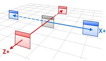
In the Cardflow 3D view, cards are laid out in a 3-dimensional viewport, meaning that they can be positioned along the X, Y, and Z axes. The card groups located to either side of the center card can be offset from the middle of the center card through the SideCardsXOffset and SideCardsZOffset properties. Changing the X or Z side-card offsets results in the side cards being moved along the corresponding X or Z axis. Offsets are measured in card widths, meaning that an offset of +1 on the Z axis will cause the side-cards to move 1 card width forward (see Figure 2).
|
|
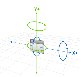
Figure 3: X- and Y-angle rotations |
The SideCardsXSpacing and SideCardsZSpacing properties indicate, in card widths, the X- and Z-axis spacing between the side cards; however, the spacing between the center card and the immediate left and right side cards will not be affected (see the SideCardsXOffset and SideCardsZOffset properties). The X- and Y-angle of the side cards can also be changed through the SideCardsXAngle and SideCardsYAngle properties, which will rotate the cards around the corresponding X or Y axis (see Figure 3). The same angle modifications can also be made to the center card by changing the values of the CenterCardXAngle and CenterCardYAngle properties.
The maximum number of cards that are displayed to both the left and right of the center card is determined by the SideCardsCount property. Cards that are in the viewport but outside the side-card range will not display a surface but rather the brush specified through the EmptySurfaceBrush property will be applied (see Example 2). When the "empty" cards are brought within range, the appropriate surface will be applied. When cards exit the specified range, their surfaces will be "removed" and the empty-surface brush will be used.
Cards have reflections that can be removed by setting the ShowReflections property to false (see also Tips for 3D Performance).
The physical card size in relation to the height of the viewport can be modified through the CardHeightToViewportRatio property, which, by default, specifies that the cards are 75% of the viewport's height. For example setting this property to 1 will result in the cards occupying the full height of the viewport, while a value of 2 will result in the cards being twice the height of the viewport.
All examples in this topic assume that the grid is bound to the Employees table of the Northwind database, unless stated otherwise.
Example 1: Providing surface configurations
The following example demonstrates how to provide an image and title surface configuration that will be applied to the center surface and a title surface configuration that will be applied to the left and right side cards.
| XAML |
Copy Code |
|---|---|
<Grid xmlns:xcdg="http://schemas.xceed.com/wpf/xaml/datagrid"> <Grid.Resources> <xcdg:DataGridCollectionViewSource x:Key="cvs_employees" Source="{Binding Source={x:Static Application.Current}, Path=EmployeesTable}"/> </Grid.Resources> <xcdg:DataGridControl x:Name="EmployeesGrid" ItemsSource="{Binding Source={StaticResource cvs_employees}}"> <xcdg:DataGridControl.Columns> <xcdg:Column FieldName="LastName" IsMainColumn="True"/> </xcdg:DataGridControl.Columns> <xcdg:DataGridControl.View> <xcdg:CardflowView3D> <xcdg:CardflowView3D.Theme> <xcdg:ElementalBlackTheme> <xcdg:ElementalBlackTheme.SurfaceConfigurations> <!-- Because an attempt is made to automatically detect an image in the data item, there is no need to specify the name of the field that contains the image in the surface configuration's ImageRegionConfiguration. If a data item contains more than one image you can set the FieldNames property of the ImageRegionConfiguration to the name of the field that contains the desired image. --> <xcdg:ImageAndTitleSurfaceConfiguration xcdg:CardflowView3D.Surfaces="Center"/> <!-- By default, the value of the main column will be displayed in the title regions. --> <xcdg:TitleSurfaceConfiguration xcdg:CardflowView3D.Surfaces="Left, Right"/> </xcdg:ElementalBlackTheme.SurfaceConfigurations> </xcdg:ElementalBlackTheme> </xcdg:CardflowView3D.Theme> </xcdg:CardflowView3D> </xcdg:DataGridControl.View> </xcdg:DataGridControl> </Grid> | |
| VB.NET |
Copy Code |
|---|---|
dataGridControl.Columns( "LastName" ).IsMainColumn = True Dim view As New CardflowView3D() Dim theme As New ElementalBlackTheme() ' Because an attempt is made to automatically detect an image in the data ' item, there is no need to specify the name of the field that contains ' the image in the surface configuration's ImageRegionConfiguration. ' If a data item contains more than one image you can set the FieldNames ' property of the ImageRegionConfiguration to the name of the field that ' contains the desired image. Dim imageAndTitleSurfaceConfiguration As new ImageAndTitleSurfaceConfiguration() imageAndTitleSurfaceConfiguration.SetValue( CardflowView3D.SurfacesProperty, CardflowView3DSurfaces.Center ) ' By default, the value of the main column will be displayed in the title regions. Dim titleSurfaceConfiguration As New TitleSurfaceConfiguration() titleSurfaceConfiguration.SetValue( CardflowView3D.SurfacesProperty, CardflowView3DSurfaces.Left And CardflowView3DSurfaces.Right ) theme.SurfaceConfigurations.Add( imageAndTitleSurfaceConfiguration ) theme.SurfaceConfigurations.Add( titleSurfaceConfiguration ) view.Theme = theme dataGridControl.View = view | |
| C# |
Copy Code |
|---|---|
dataGridControl.Columns[ "LastName" ].IsMainColumn = true; CardflowView3D view = new CardflowView3D(); ElementalBlackTheme theme = new ElementalBlackTheme(); // Because an attempt is made to automatically detect an image in the data // item, there is no need to specify the name of the field that contains // the image in the surface configuration's ImageRegionConfiguration. // If a data item contains more than one image you can set the FieldNames // property of the ImageRegionConfiguration to the name of the field that // contains the desired image. ImageAndTitleSurfaceConfiguration imageAndTitleSurfaceConfiguration = new ImageAndTitleSurfaceConfiguration(); imageAndTitleSurfaceConfiguration.SetValue( CardflowView3D.SurfacesProperty, CardflowView3DSurfaces.Center ); // By default, the value of the main column will be displayed in the title regions. TitleSurfaceConfiguration titleSurfaceConfiguration = new TitleSurfaceConfiguration(); titleSurfaceConfiguration.SetValue( CardflowView3D.SurfacesProperty, CardflowView3DSurfaces.Left | CardflowView3DSurfaces.Right ); theme.SurfaceConfigurations.Add( imageAndTitleSurfaceConfiguration ); theme.SurfaceConfigurations.Add( titleSurfaceConfiguration ); view.Theme = theme; dataGridControl.View = view; | |
Example 2: Providing an empty-surface brush
The following example demonstrates how to provide an empty-surface brush, which will be applied to all cards that do not display a surface.
| XAML |
Copy Code |
|---|---|
<Grid xmlns:xcdg="http://schemas.xceed.com/wpf/xaml/datagrid"> <Grid.Resources> <xcdg:DataGridCollectionViewSource x:Key="cvs_employees" Source="{Binding Source={x:Static Application.Current}, Path=EmployeesTable}"/> <LinearGradientBrush x:Key="emptySurfaceBrush" StartPoint="0.5,1" EndPoint="0.5,0"> <GradientStop Offset="0" Color="#FF0E0E0E"/> <GradientStop Offset="0.33" Color="#FF323232"/> <GradientStop Offset="0.63" Color="#FF4C4C4C"/> <GradientStop Offset="1" Color="#FF949494"/> </LinearGradientBrush> </Grid.Resources> <xcdg:DataGridControl x:Name="EmployeesGrid" ItemsSource="{Binding Source={StaticResource cvs_employees}}"> <xcdg:DataGridControl.Columns> <xcdg:Column FieldName="LastName" IsMainColumn="True"/> </xcdg:DataGridControl.Columns> <xcdg:DataGridControl.View> <xcdg:CardflowView3D SideCardsCount="1" EmptySurfaceBrush="{StaticResource emptySurfaceBrush}"> <xcdg:CardflowView3D.Theme> <xcdg:ElementalBlackTheme/> </xcdg:CardflowView3D.Theme> </xcdg:CardflowView3D> </xcdg:DataGridControl.View> </xcdg:DataGridControl> </Grid> | |
| VB.NET |
Copy Code |
|---|---|
Dim brush As New LinearGradientBrush() brush.GradientStops.Add( New GradientStop( Color.FromArgb( 255, 14, 14, 14 ), 0 ) ) brush.GradientStops.Add( New GradientStop( Color.FromArgb( 255, 50, 50, 50 ), 0.33 ) ) brush.GradientStops.Add( New GradientStop( Color.FromArgb( 255, 76, 76, 76 ), 0.63 ) ) brush.GradientStops.Add( New GradientStop( Color.FromArgb( 255, 148, 148, 148 ), 1 ) ) dataGridControl.Columns( "LastName" ).IsMainColumn = True Dim view As New CardflowView3D() view.SideCardsCount = 1 view.EmptySurfaceBrush = brush view.Theme = New ElementalBlackTheme() dataGridControl.View = view | |
| C# |
Copy Code |
|---|---|
LinearGradientBrush brush = new LinearGradientBrush(); brush.GradientStops.Add( new GradientStop( Color.FromArgb( 255, 14, 14, 14 ), 0 ) ); brush.GradientStops.Add( new GradientStop( Color.FromArgb( 255, 50, 50, 50 ), 0.33 ) ); brush.GradientStops.Add( new GradientStop( Color.FromArgb( 255, 76, 76, 76 ), 0.63 ) ); brush.GradientStops.Add( new GradientStop( Color.FromArgb( 255, 148, 148, 148 ), 1 ) ); dataGridControl.Columns[ "LastName" ].IsMainColumn = true; CardflowView3D view = new CardflowView3D(); view.SideCardsCount = 1; view.EmptySurfaceBrush = brush; view.Theme = new ElementalBlackTheme(); dataGridControl.View = view; | |
 Show All
 Hide All